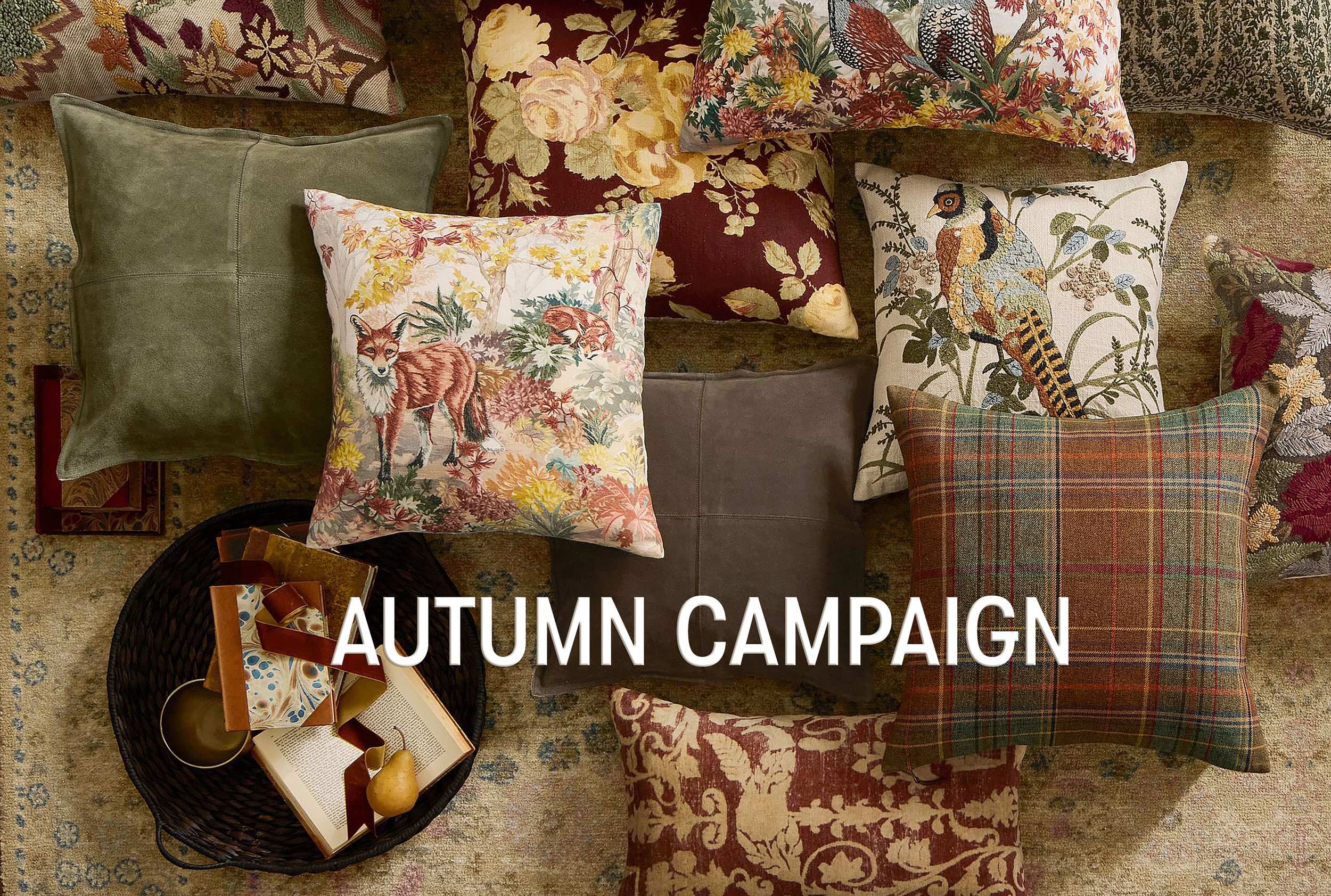
Autumn brings together distinct collections rooted in warmth — from the whimsical Fantastical Forest to more refined, material-driven designs like Sienna and Ridge Maple. Working within the broader creative direction, I owned the design execution across packaging, tabletop, and digital, developing type identities, illustration systems, and naming that held together as a unified seasonal world.
Crisp air, the scent of fallen leaves, and a shift to tones of gold, crimson, and amber. Layers return. Shorter days invite us to slow down. The season settles in.
Crisp air, the scent of fallen leaves, and a shift to tones of gold, crimson, and amber. Layers return. Shorter days invite us to slow down. The season settles in.
Autumn brings together distinct collections rooted in warmth — from the whimsical Fantastical Forest to more refined, material-driven designs like Sienna and Ridge Maple. Working within the broader creative direction, I owned the design execution across packaging, tabletop, and digital, developing type identities, illustration systems, and naming that held together as a unified seasonal world.
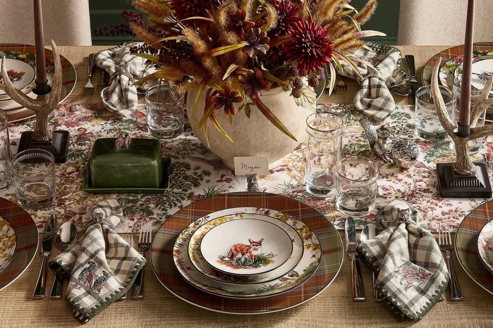
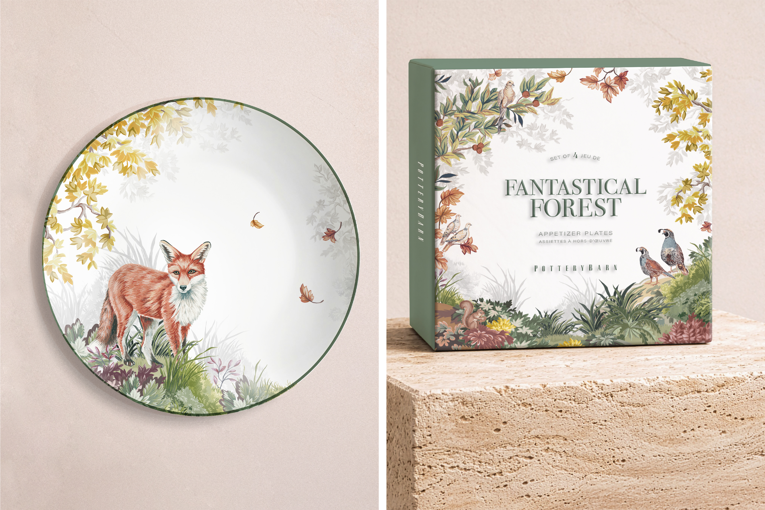
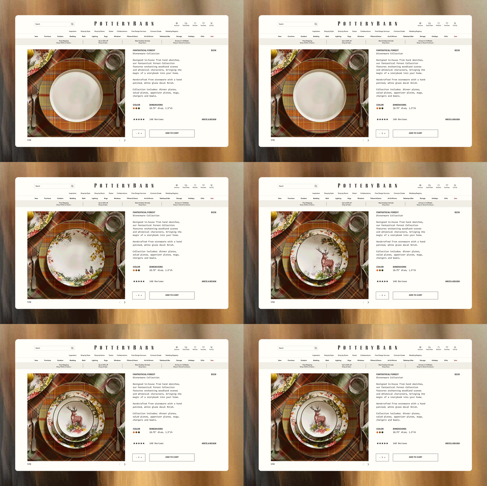
Fantastical Forest started with a fox. A designer spotted one while traveling in Scotland — and that single image became the anchor for one of Pottery Barn's best-selling autumn collections. Working from illustrations and patterns developed in the art studio, I built the brand identity around the collection — carrying it from tabletop to textiles and extending from retail packaging to digital.
Fantastical Forest started with a fox. A designer spotted one while traveling in Scotland — and that single image became the anchor for one of Pottery Barn's best-selling autumn collections. I built the brand identity around that moment — carrying it from tabletop to textiles, retail packaging to digital, all the way through to custom backstamps on the ceramics.
The collection sold out in its first season and expanded into a second year — a testament to how deeply the identity connected with customers.
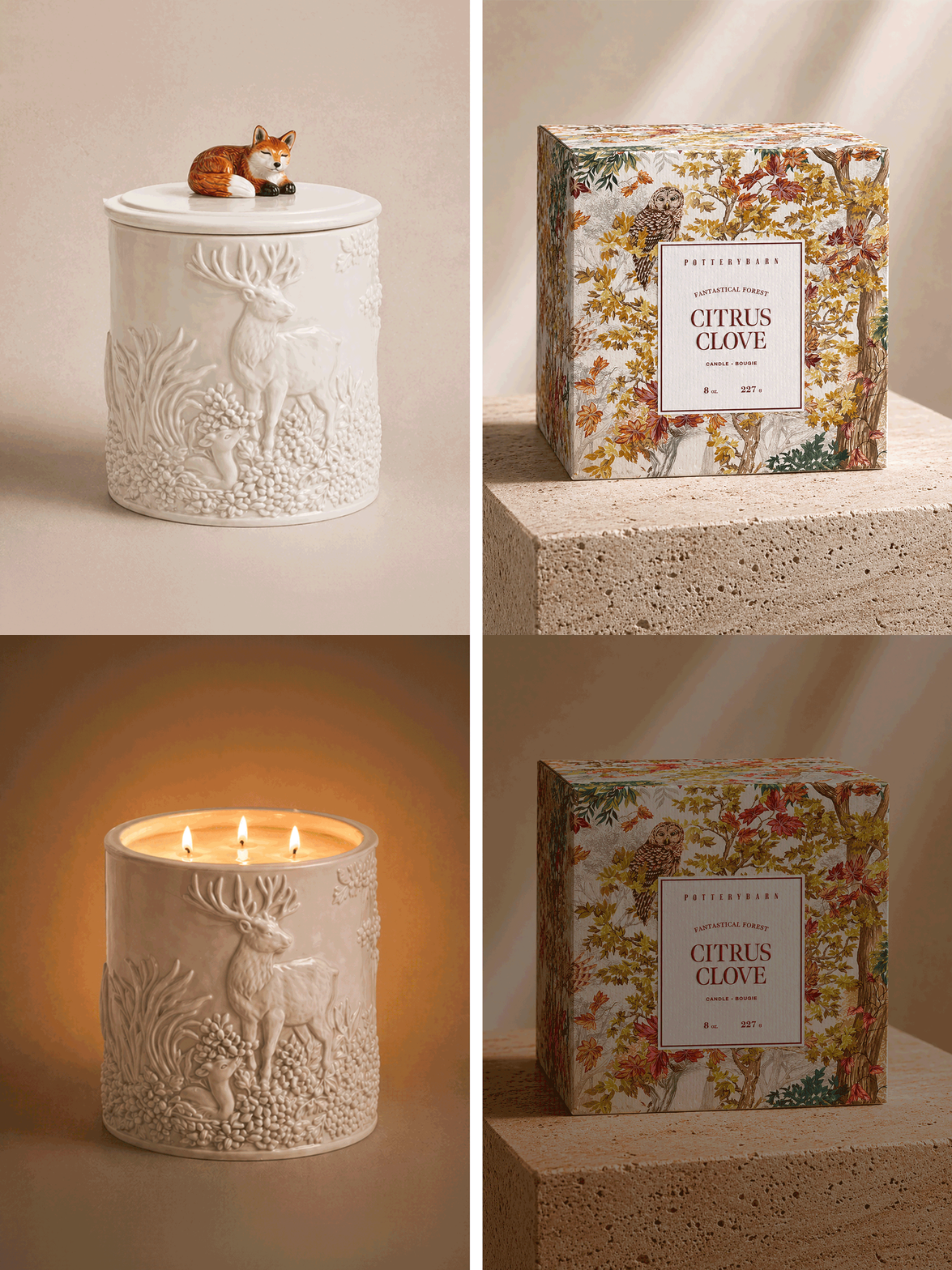
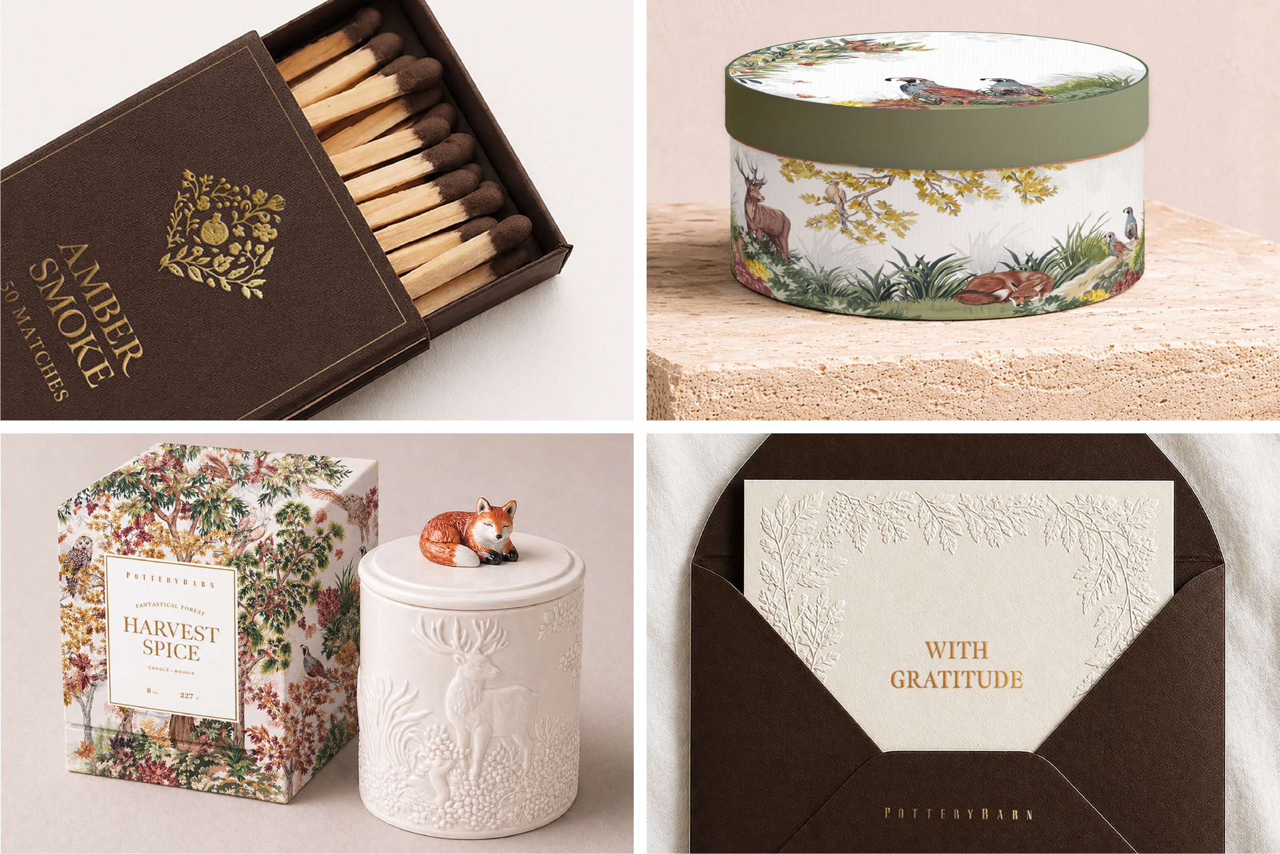
The identity went all the way through to product: custom backstamps on the ceramic collection, and figural barware. The collection sold out in its first season and expanded into a second year — including a figural home scent collection I designed and a complimentary stationary collection — a testament to how deeply the identity connected with customers.
The identity went all the way through to product: custom backstamps on the ceramic collection, and figural barware. The collection sold out in its first season and expanded into a second year — including a figural home scent collection I designed and a complimentary stationary collection — a testament to how deeply the identity connected with customers.
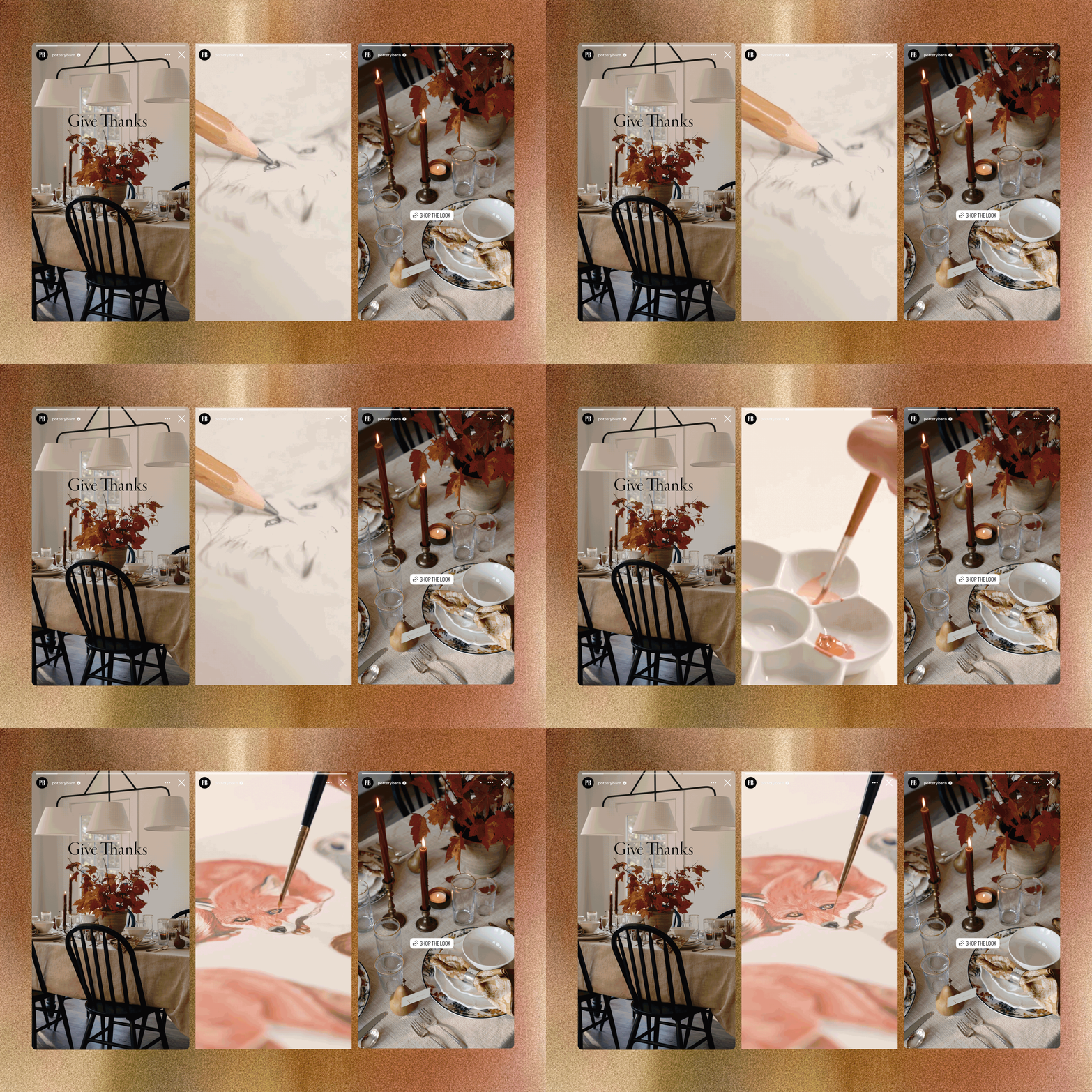
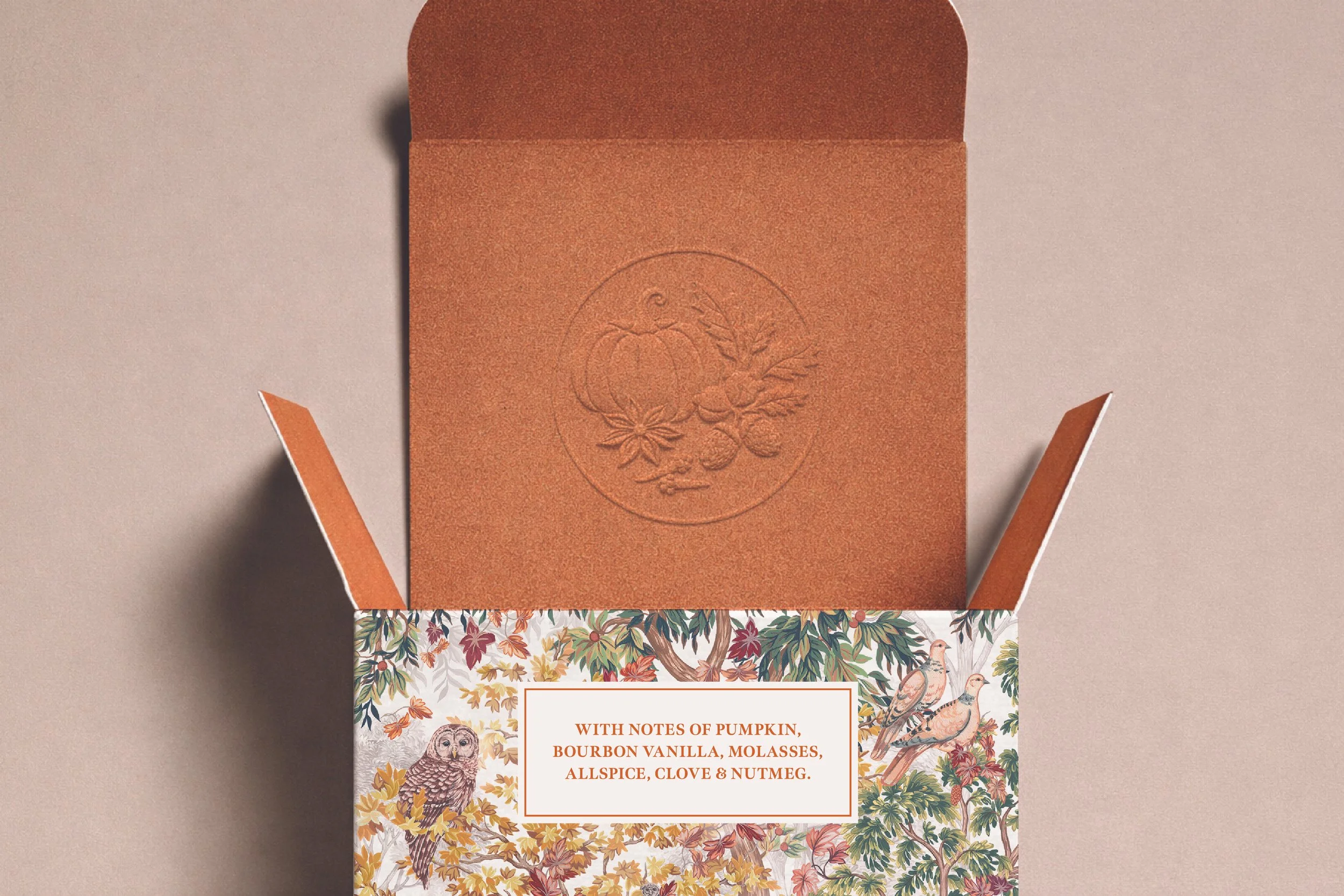
Every detail was considered — from a surprise of color and texture when the box was opened, to a pattern composed to wrap seamlessly around packaging.
The same identity translated digitally across paid social and Instagram stories, including behind-the-scenes content showing the illustrations being made.
Every detail was considered — from a surprise of color and texture when the box was opened, to a pattern composed to wrap seamlessly around packaging.
The same identity translated digitally across paid social and Instagram stories, including behind-the-scenes content showing the illustrations being made.
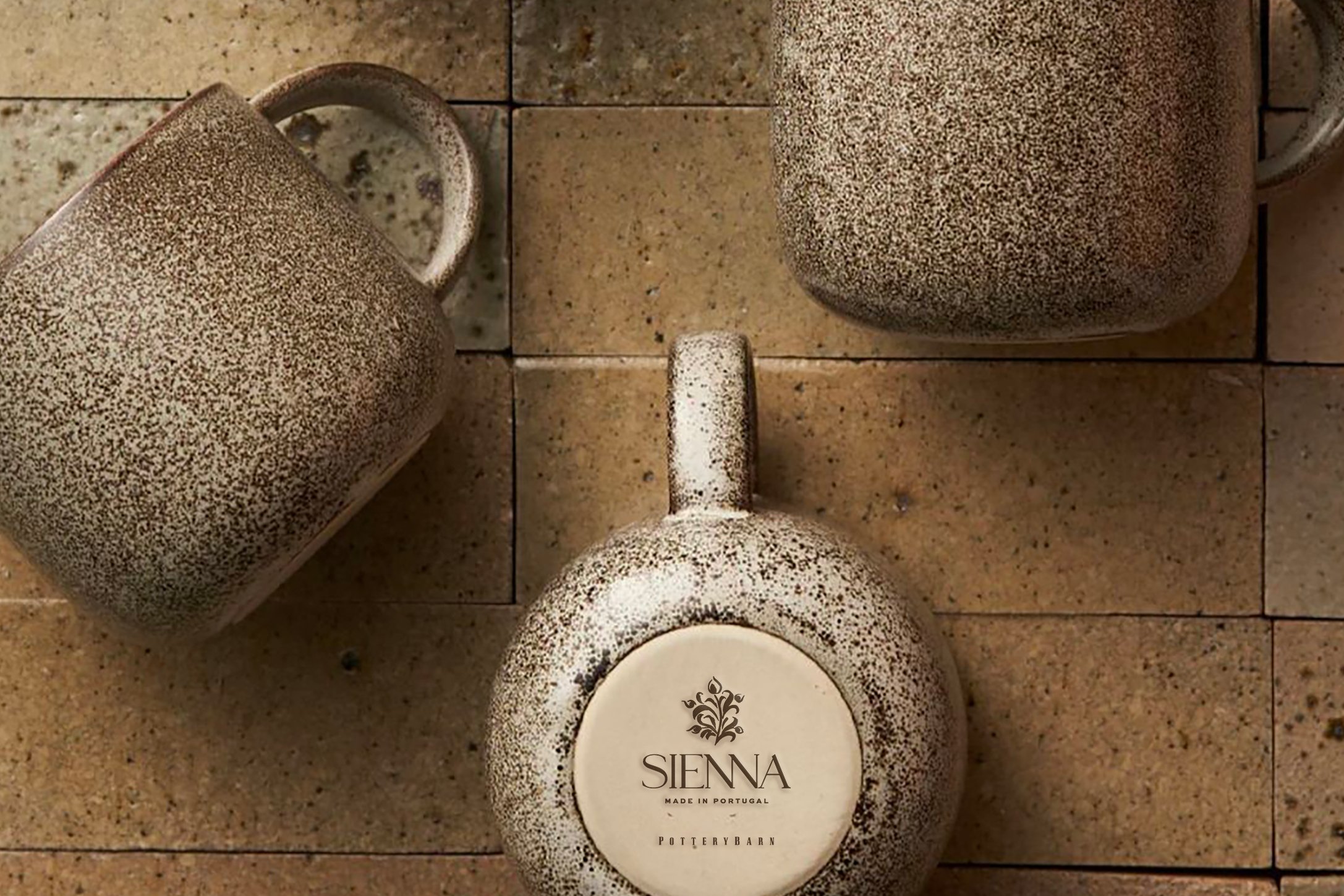
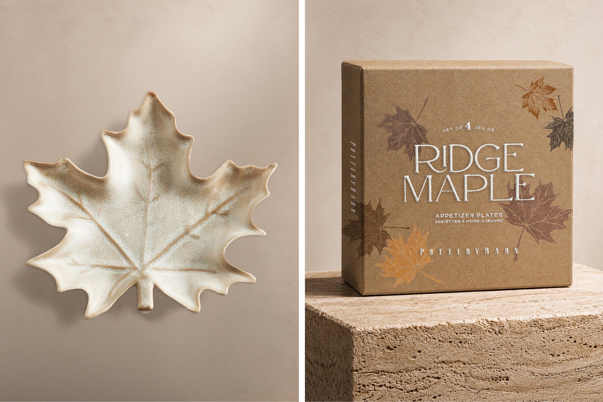
Not every collection led with illustration. Sienna, Ridge Maple, and Frasier were rooted in material and texture — earthy glazes, figural forms, and tactile surfaces that the packaging had to match.
Not every collection led with illustration. Sienna, Ridge Maple, and Frasier were rooted in material and texture — earthy glazes, figural forms, and tactile surfaces that the packaging had to match.
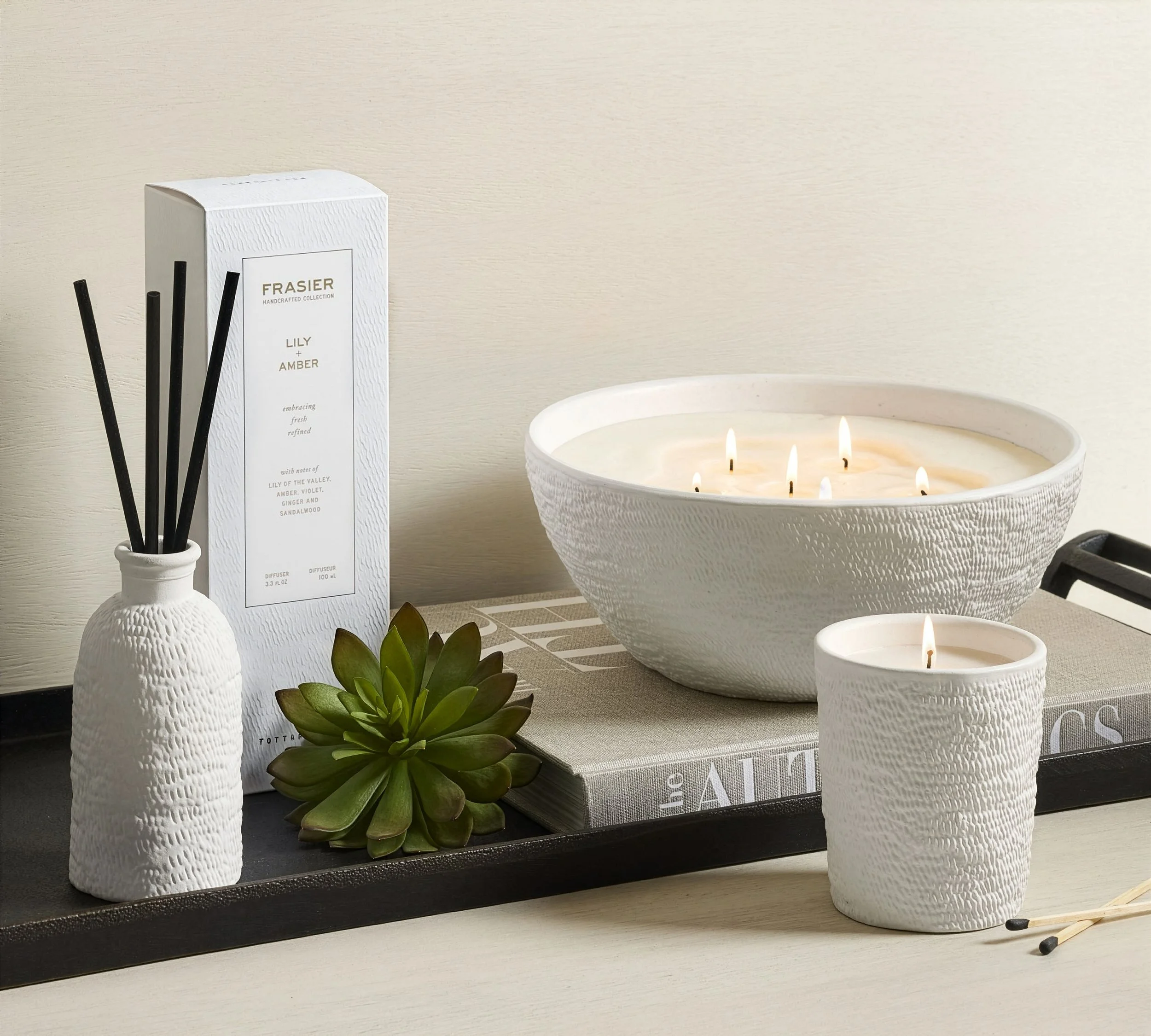
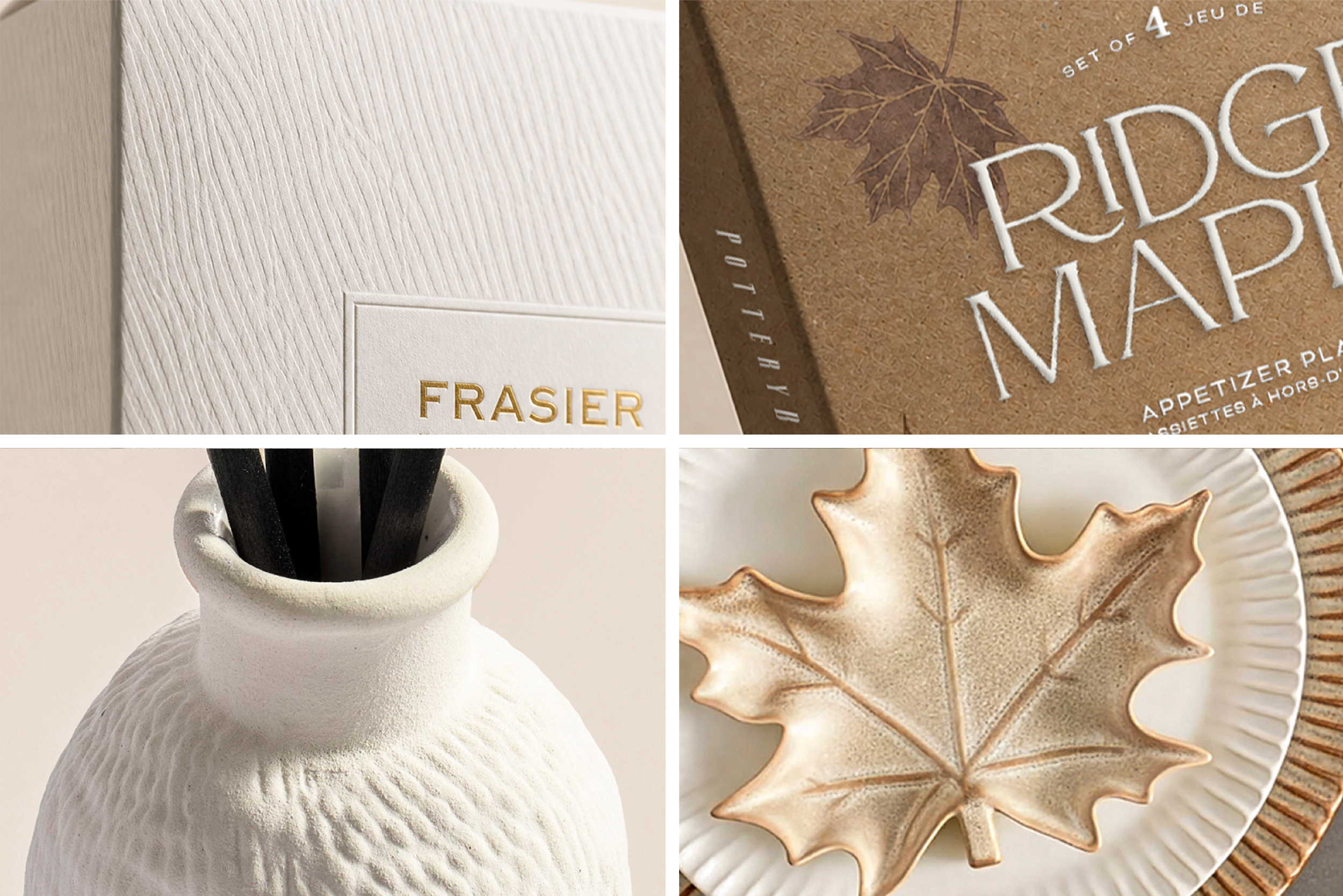
The tactile experience extended through paper textures, embossing, and finish. For Frasier, I photographed the ceramic vessel, enlarged the surface texture, and turned it into a custom emboss on the box — the packaging became an extension of the product itself.
The tactile experience extended through paper textures, embossing, and finish. For Frasier, I photographed the ceramic vessel, enlarged the surface texture, and turned it into a custom emboss on the box — the packaging became an extension of the product itself.
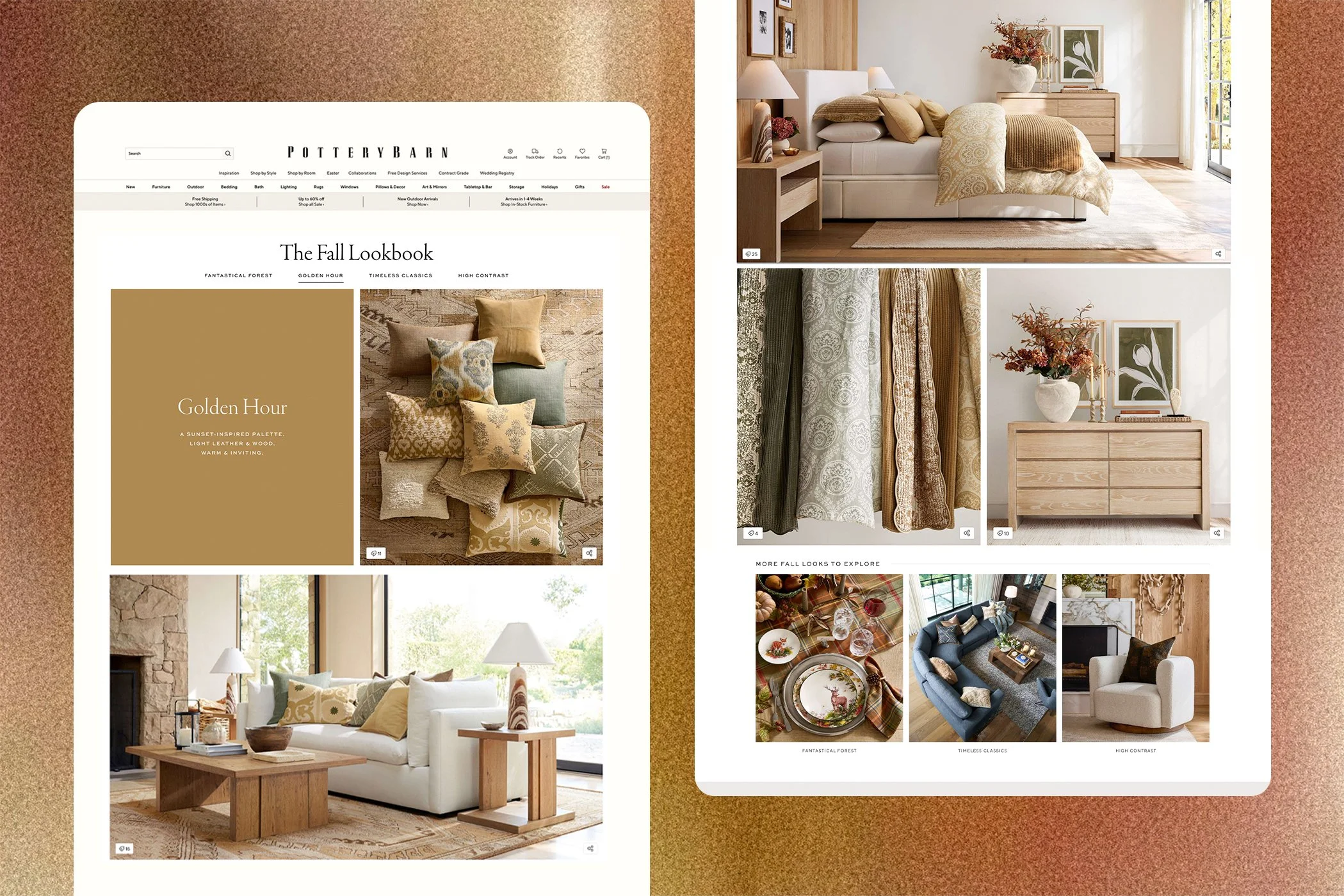
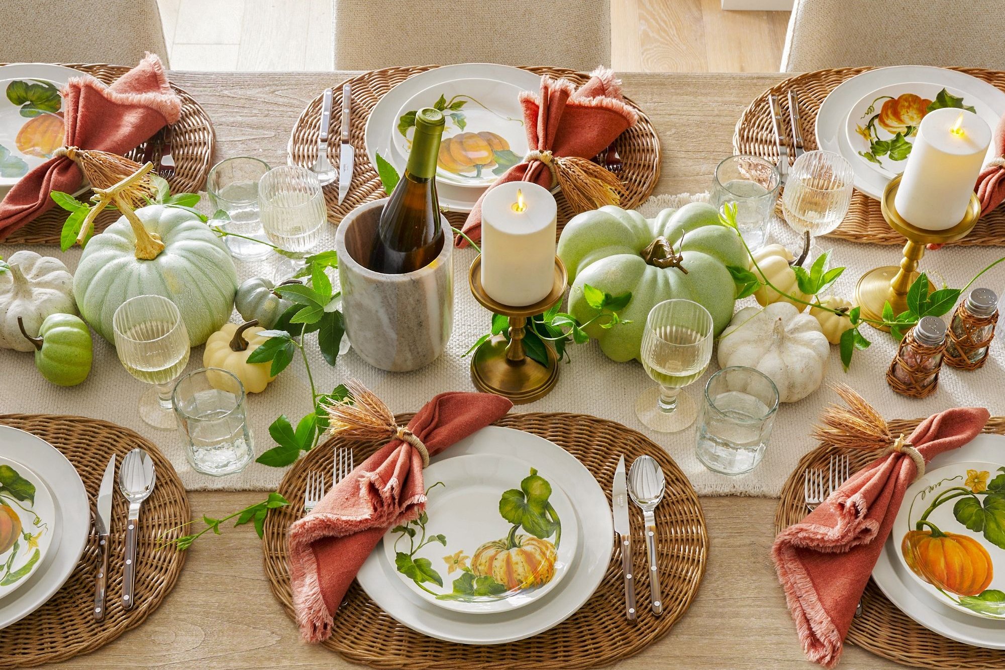
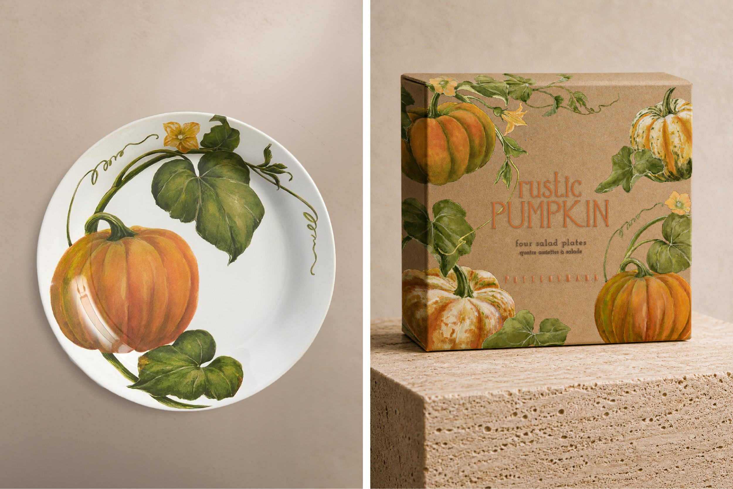
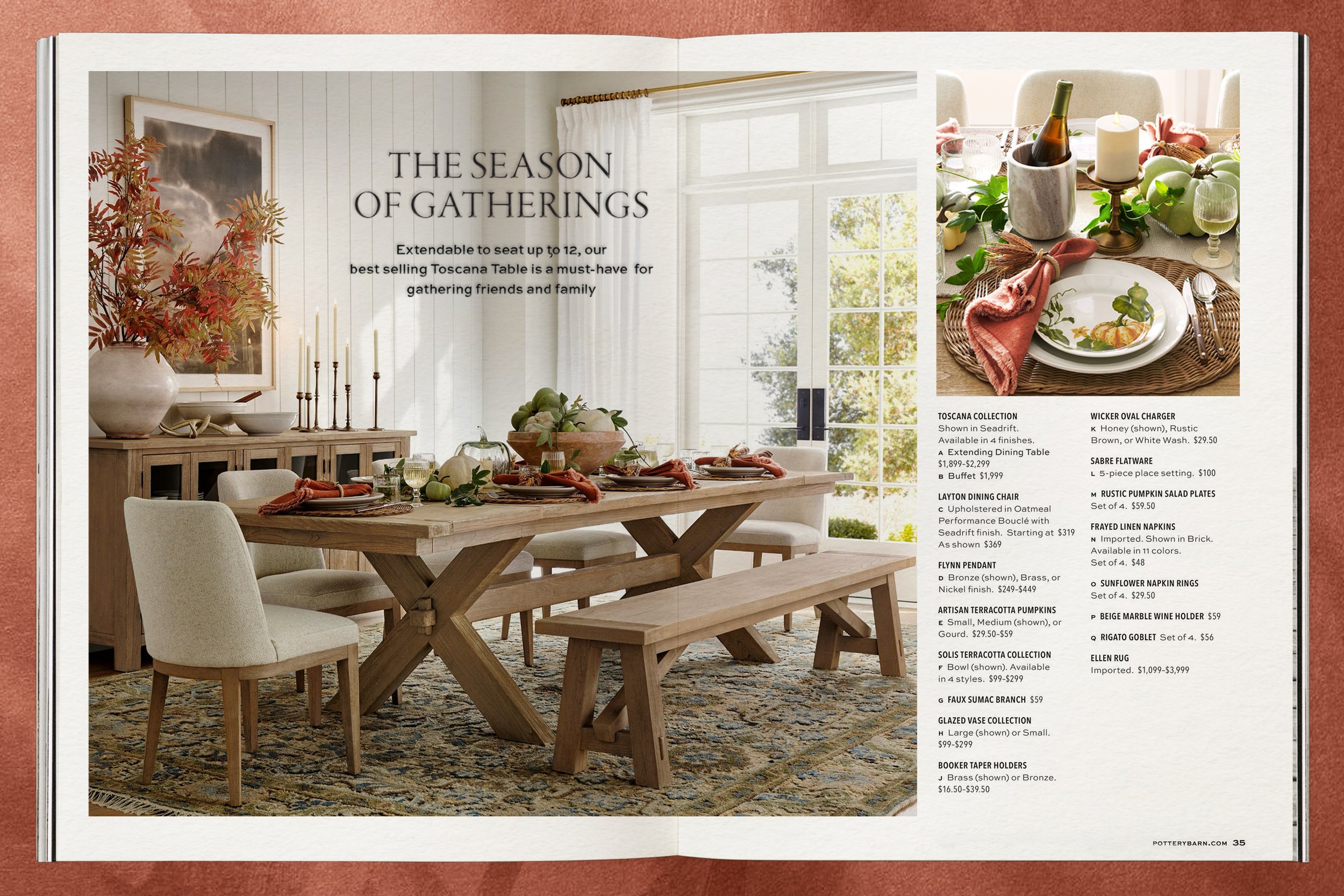
Rustic Pumpkin brought botanical illustration into tabletop and packaging. The Fall Lookbook extended the season's campaign into a dedicated web experience — Golden Hour, a sunset-inspired palette of warm leather, light wood, and amber.
Rustic Pumpkin brought botanical illustration into tabletop and packaging. The Fall Lookbook extended the season's campaign into a dedicated web experience — Golden Hour, a sunset-inspired palette of warm leather, light wood, and amber.
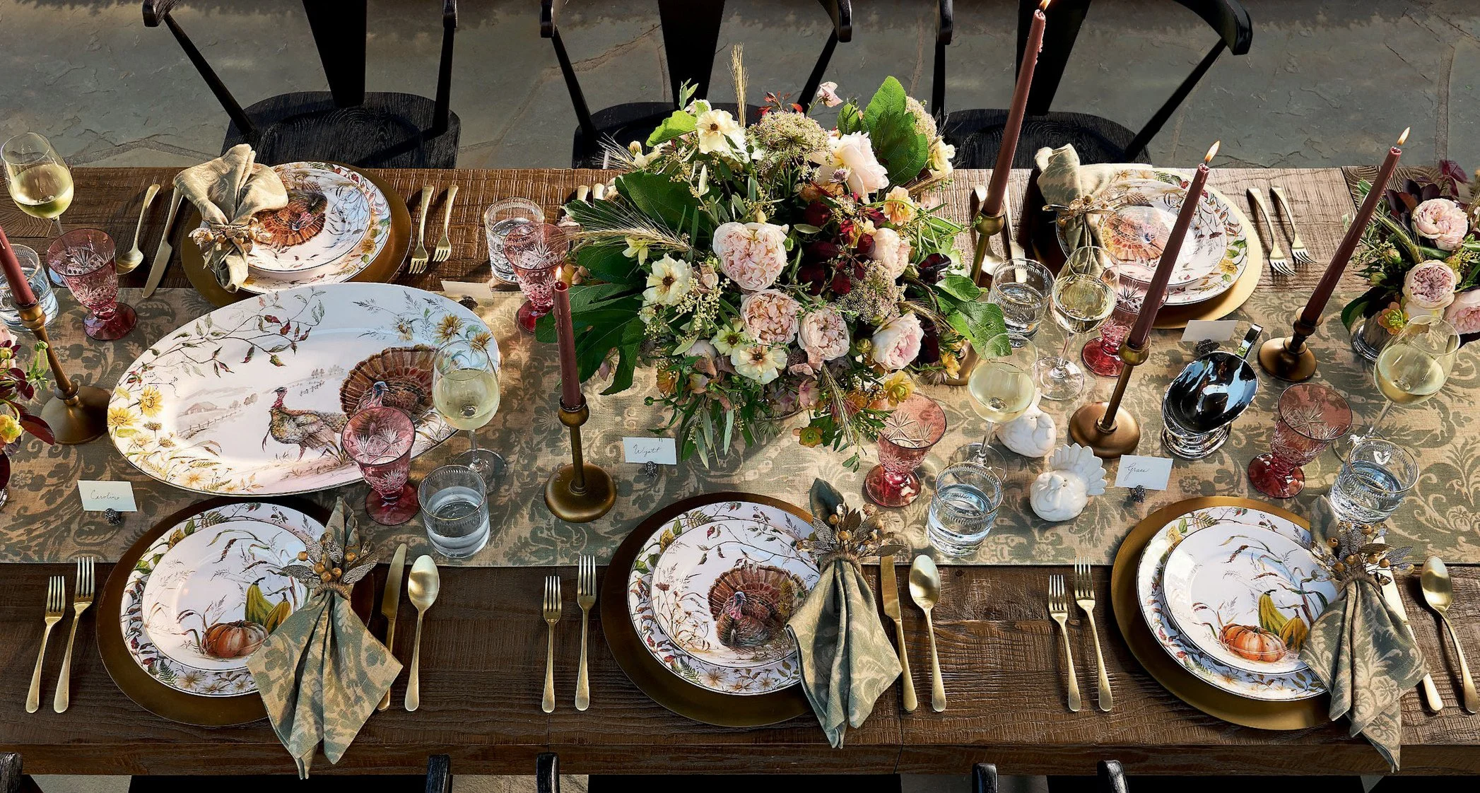
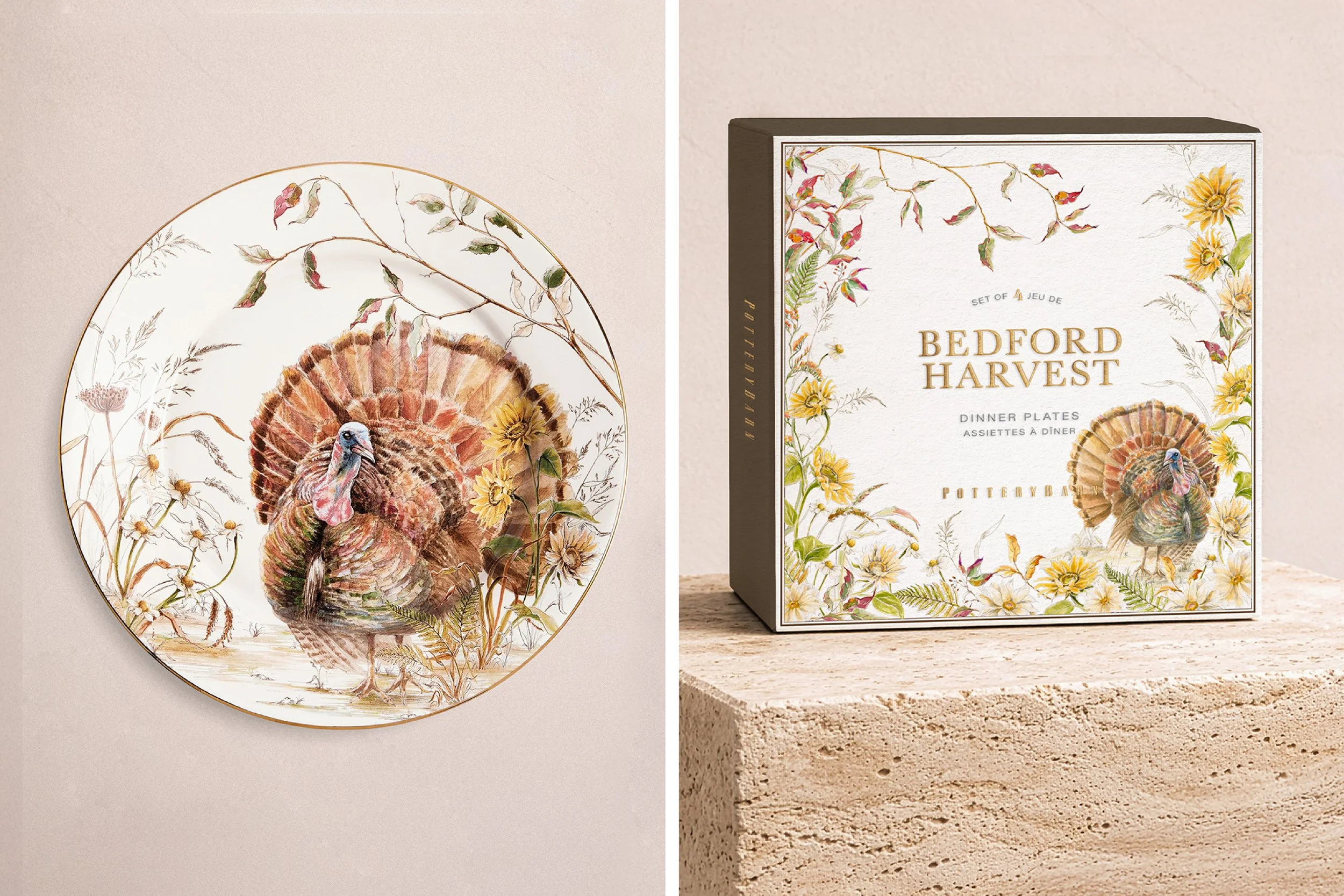
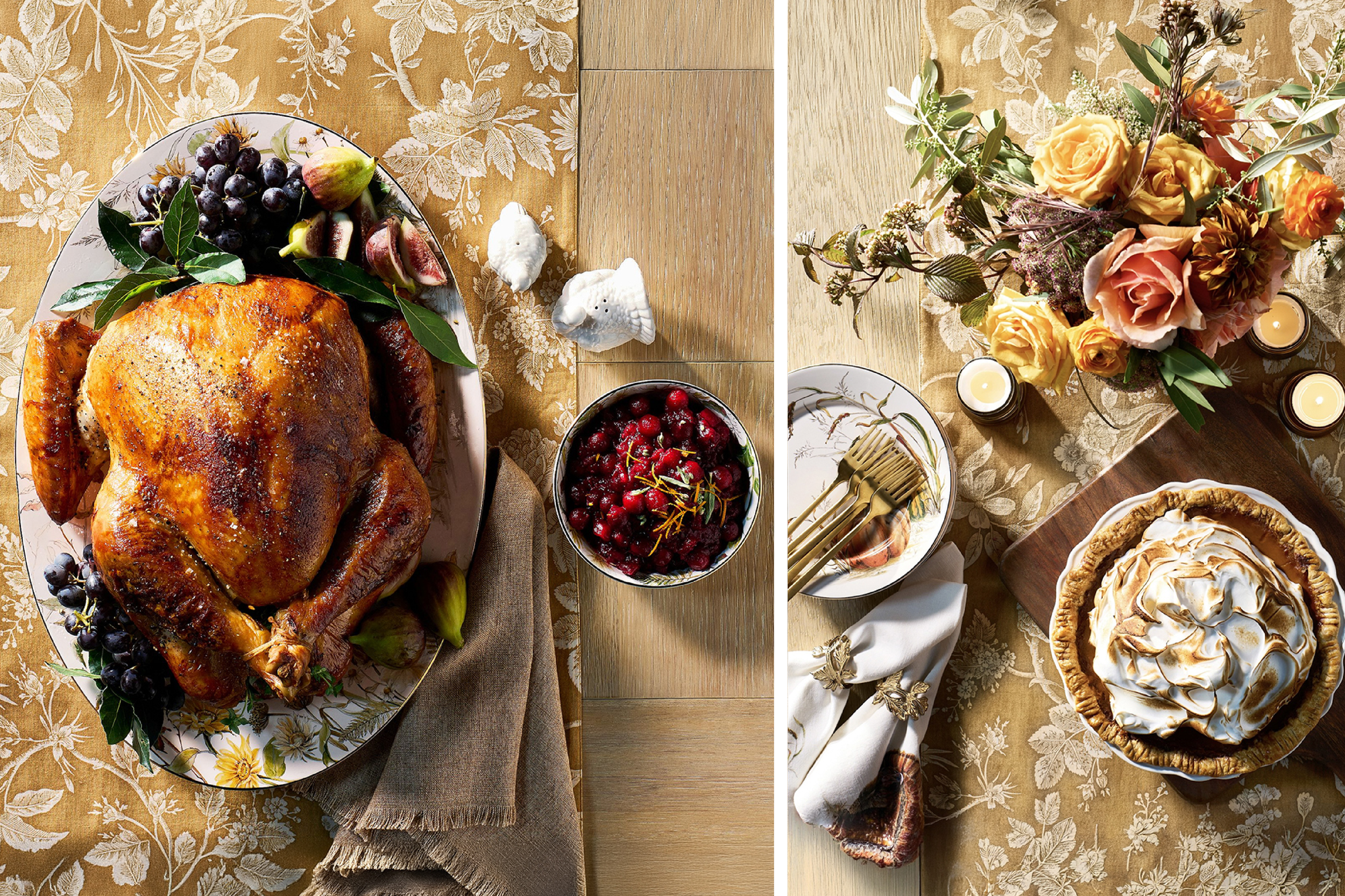
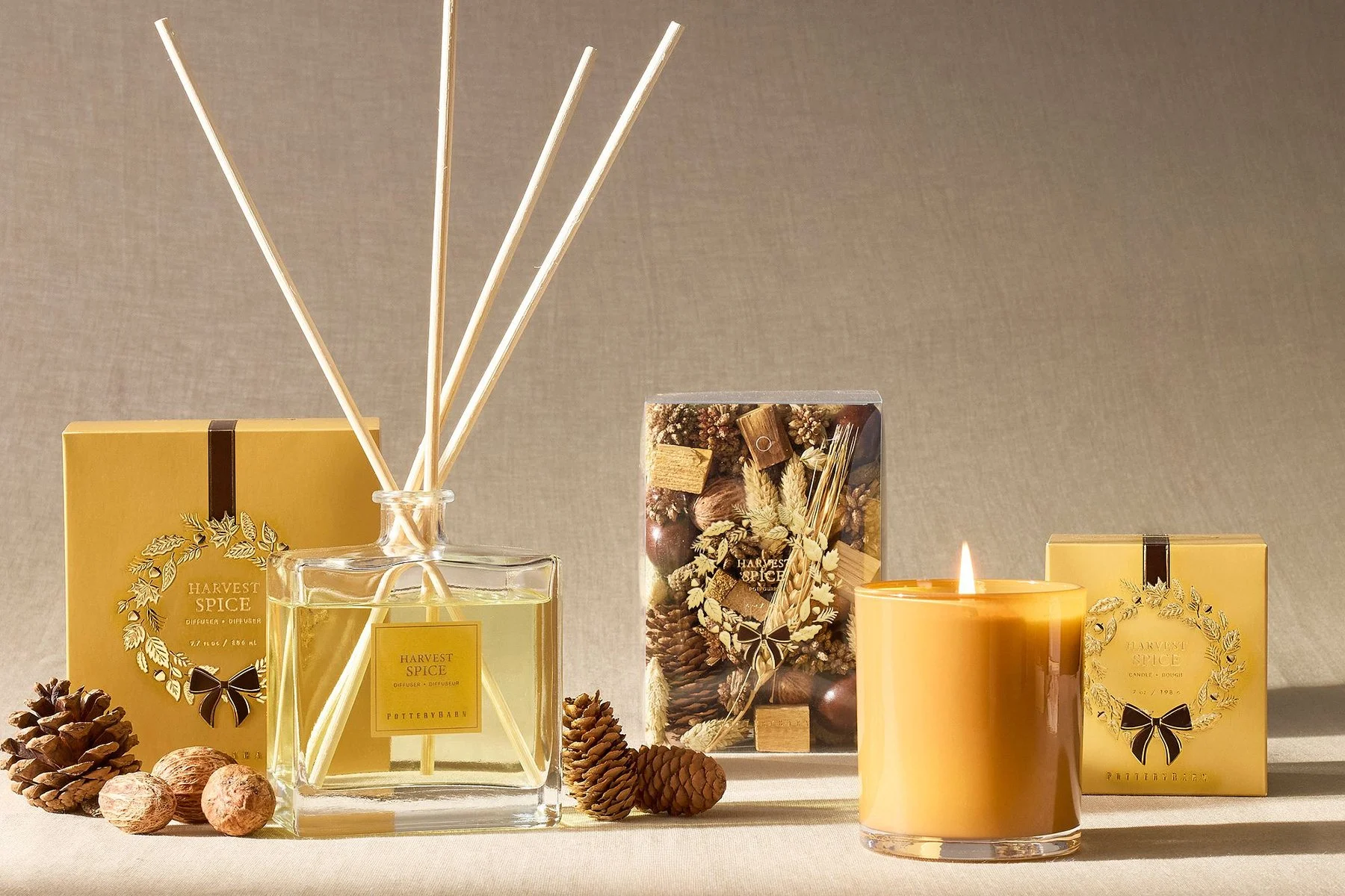
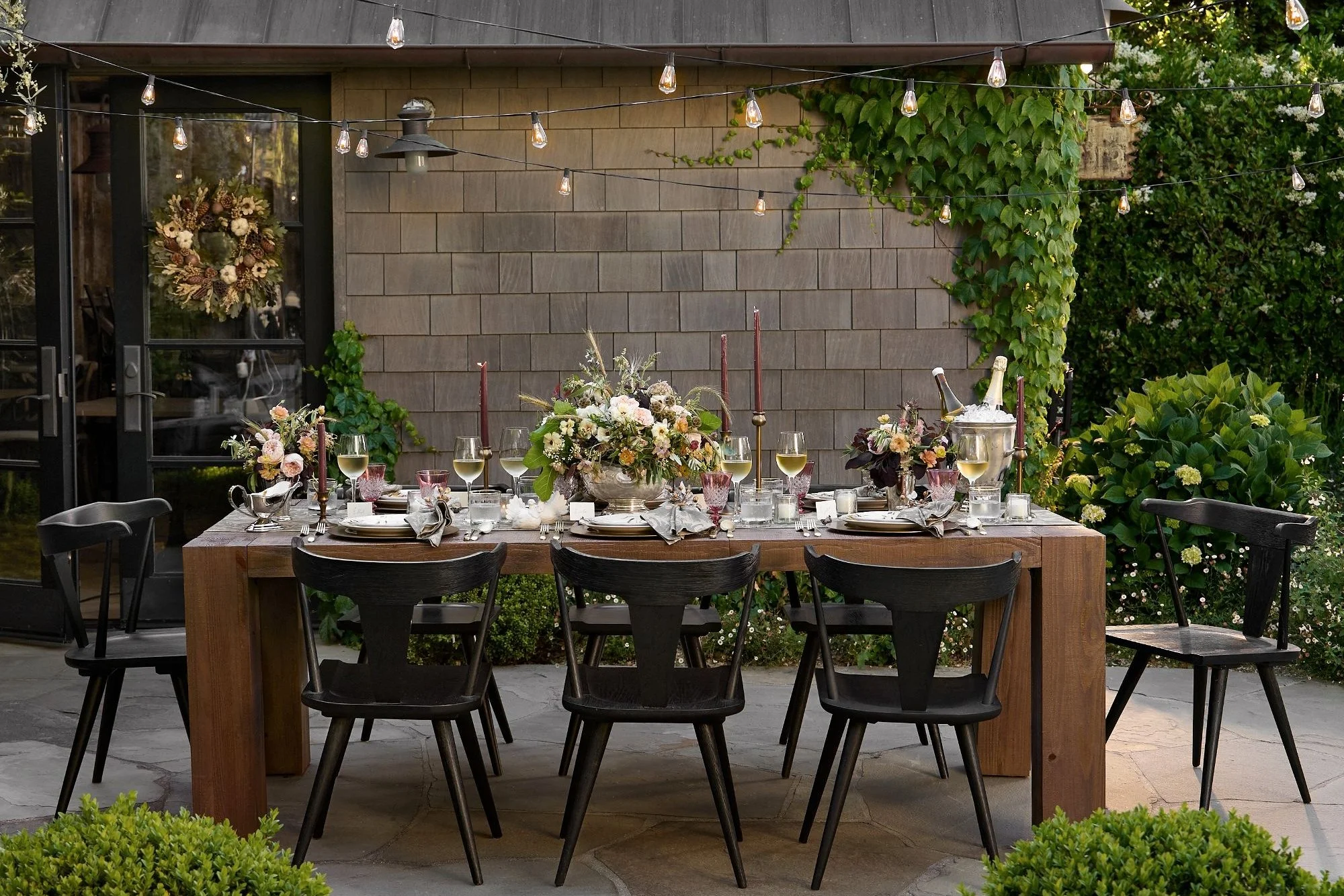
For Thanksgiving, I designed Bedford Harvest — a collection built around heritage turkey illustration and fall botanicals, rendered in deep browns and burnt amber. The identity extended across more than twenty tabletop piece types, from dinner plates to gravy boats. The fall harvest homescent line ran alongside it — a foil-embossed wreath packaging system originally developed for holiday, redesigned for the season with wheat, leaves, and a warm harvest palette. Together they shaped the full visual and sensory world of the season.
For Thanksgiving, I designed Bedford Harvest — a collection built around heritage turkey illustration and fall botanicals, rendered in deep browns and burnt amber. The identity extended across more than twenty tabletop piece types, from dinner plates to gravy boats. The fall harvest homescent line ran alongside it — a foil-embossed wreath packaging system originally developed for holiday, redesigned for the season with wheat, leaves, and a warm harvest palette. Together they shaped the full visual and sensory world of the season.
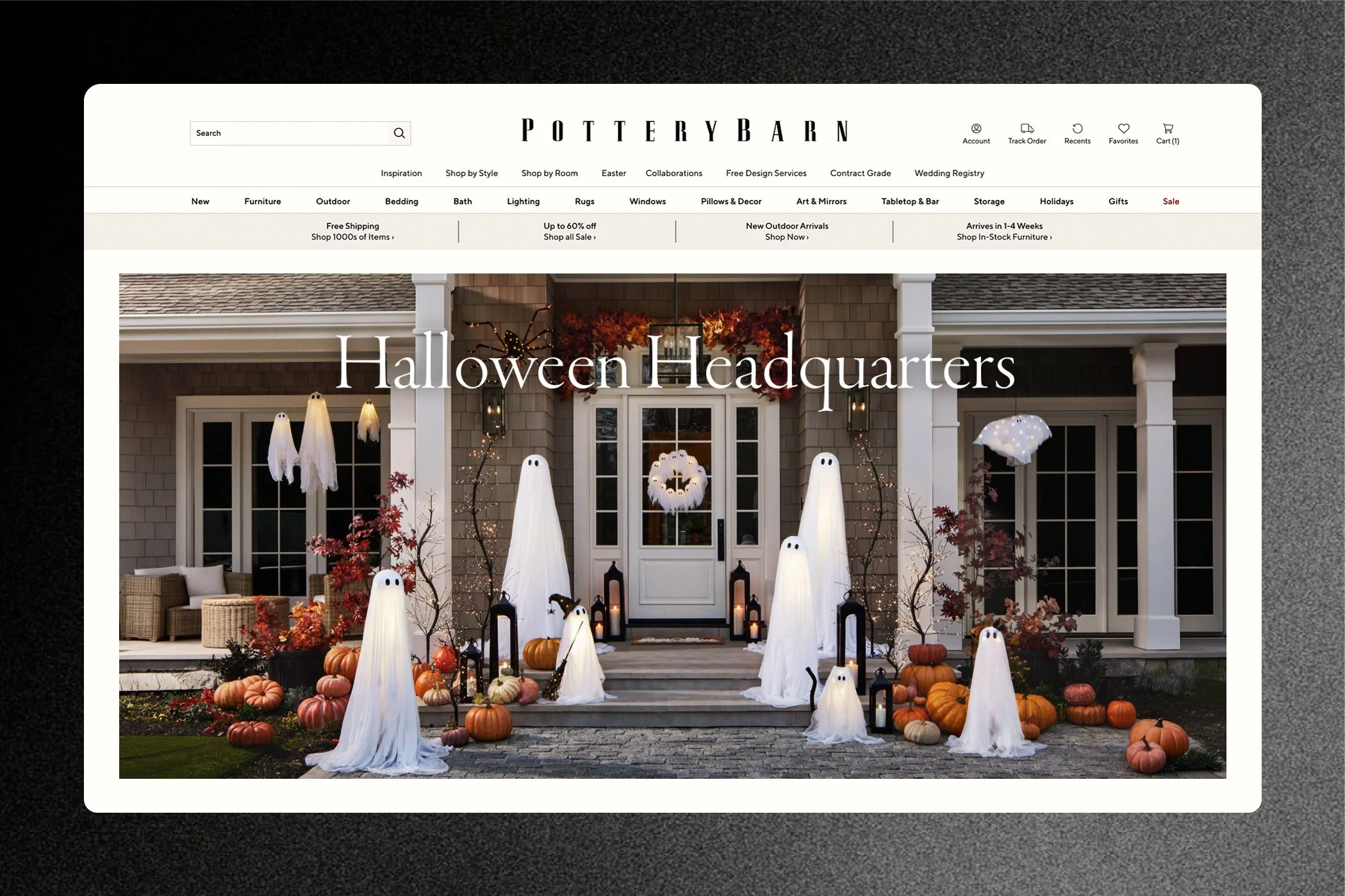
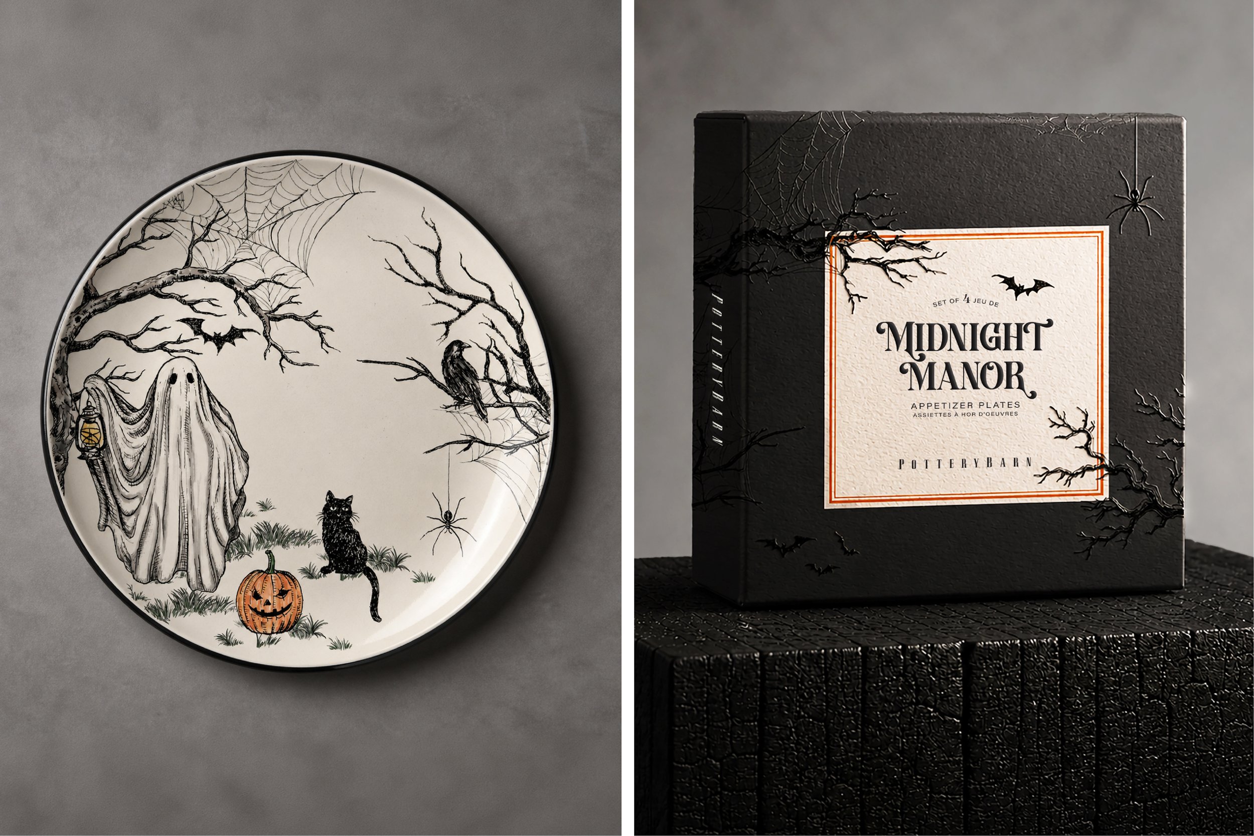
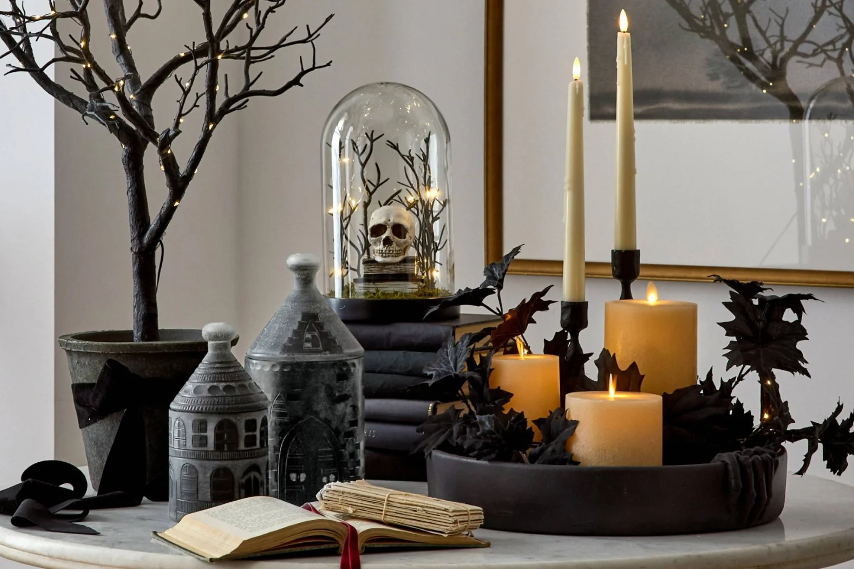
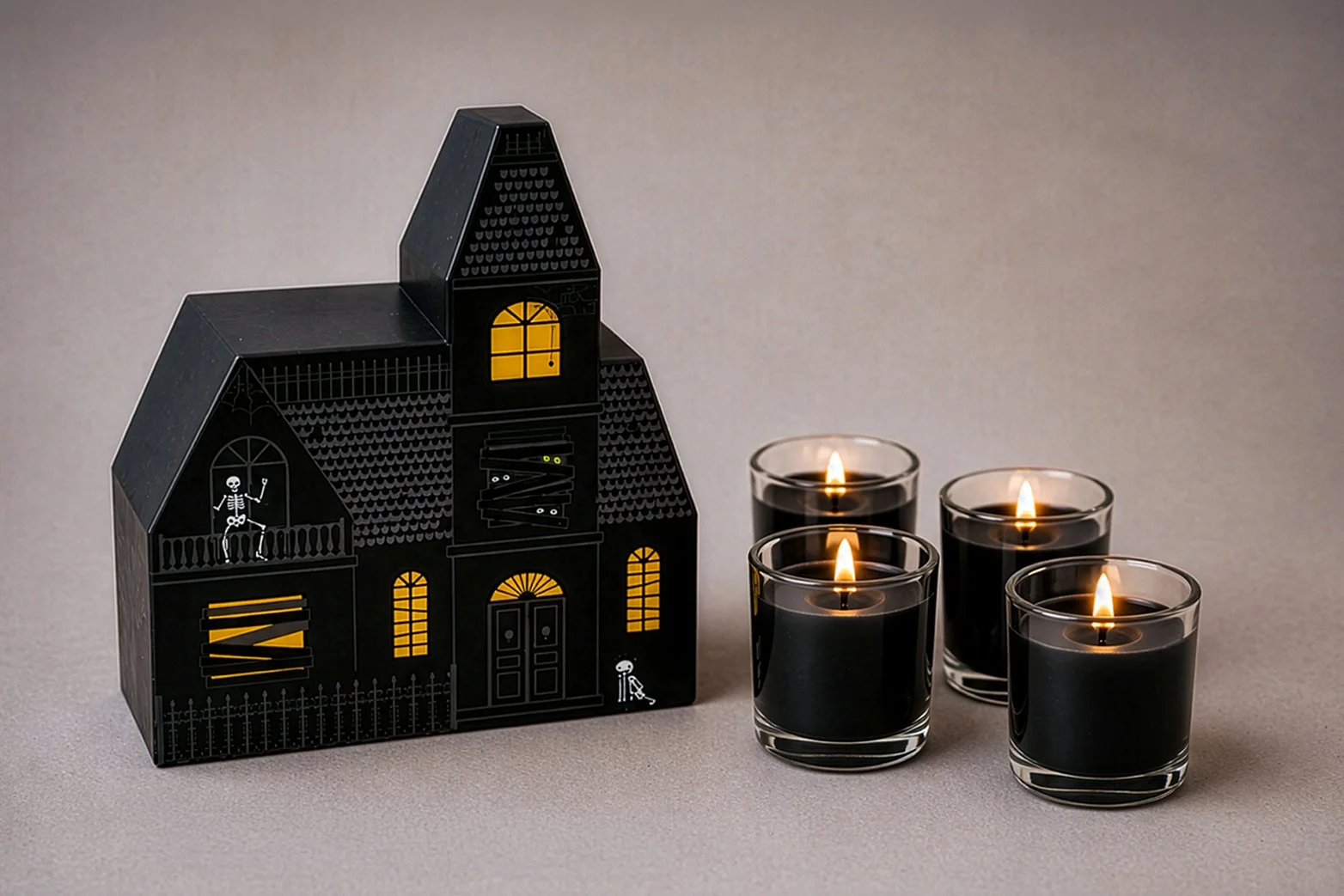
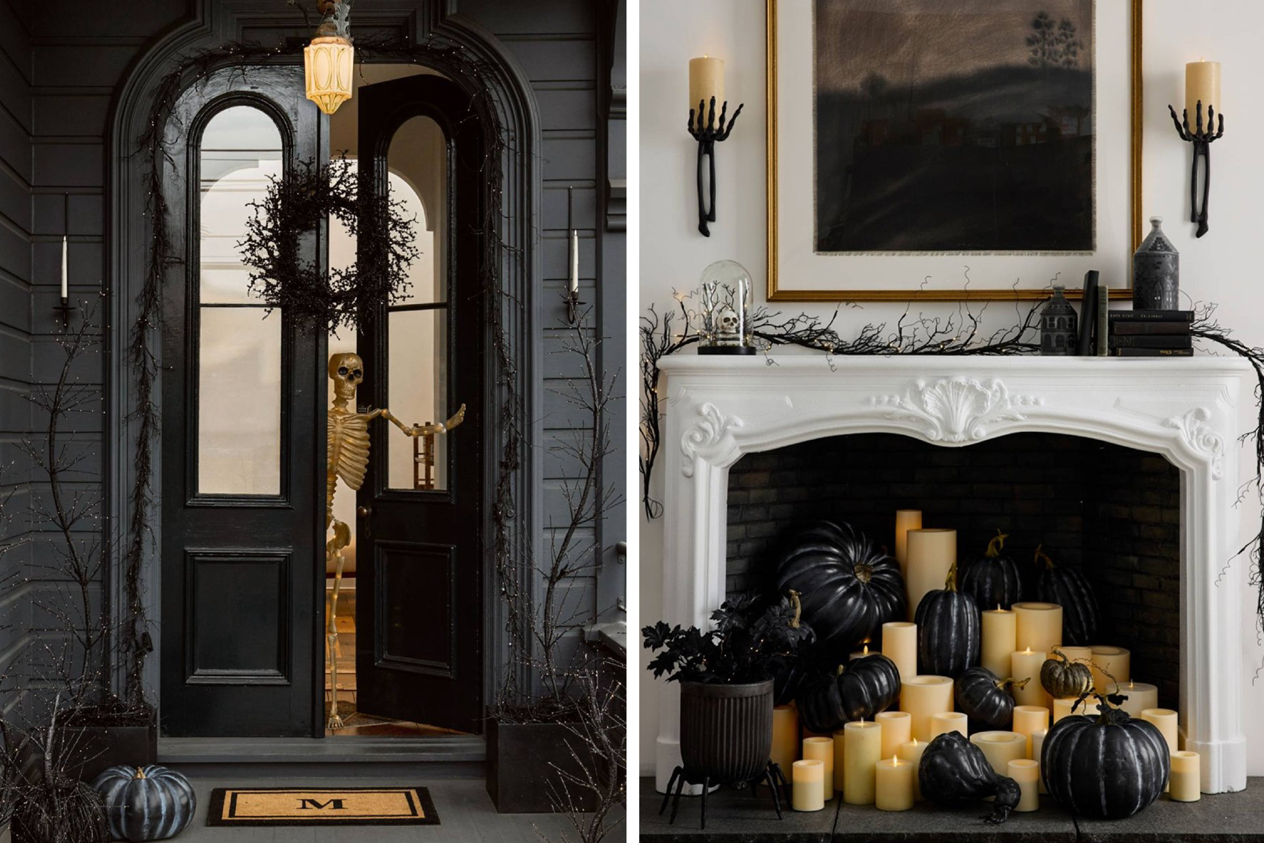
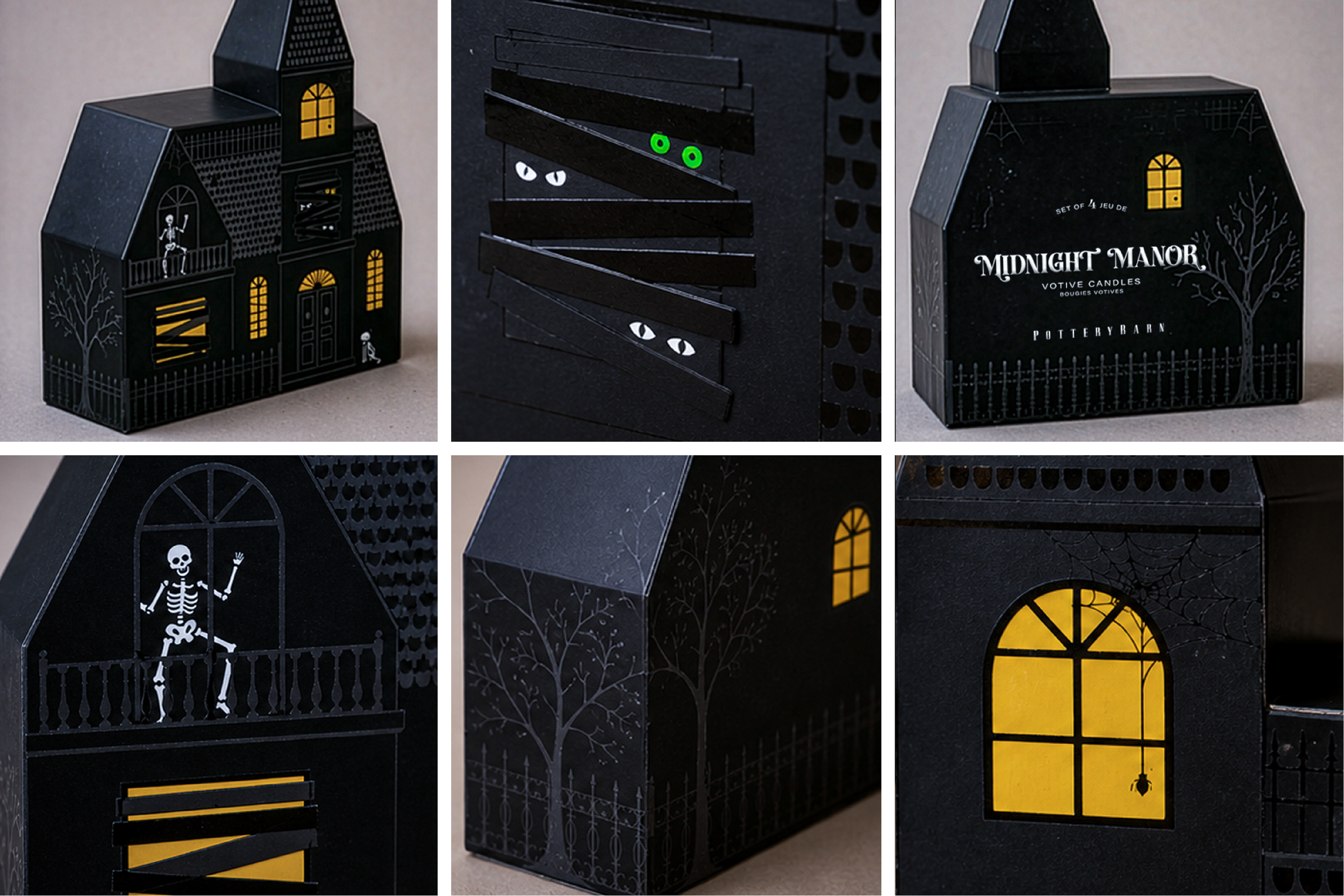
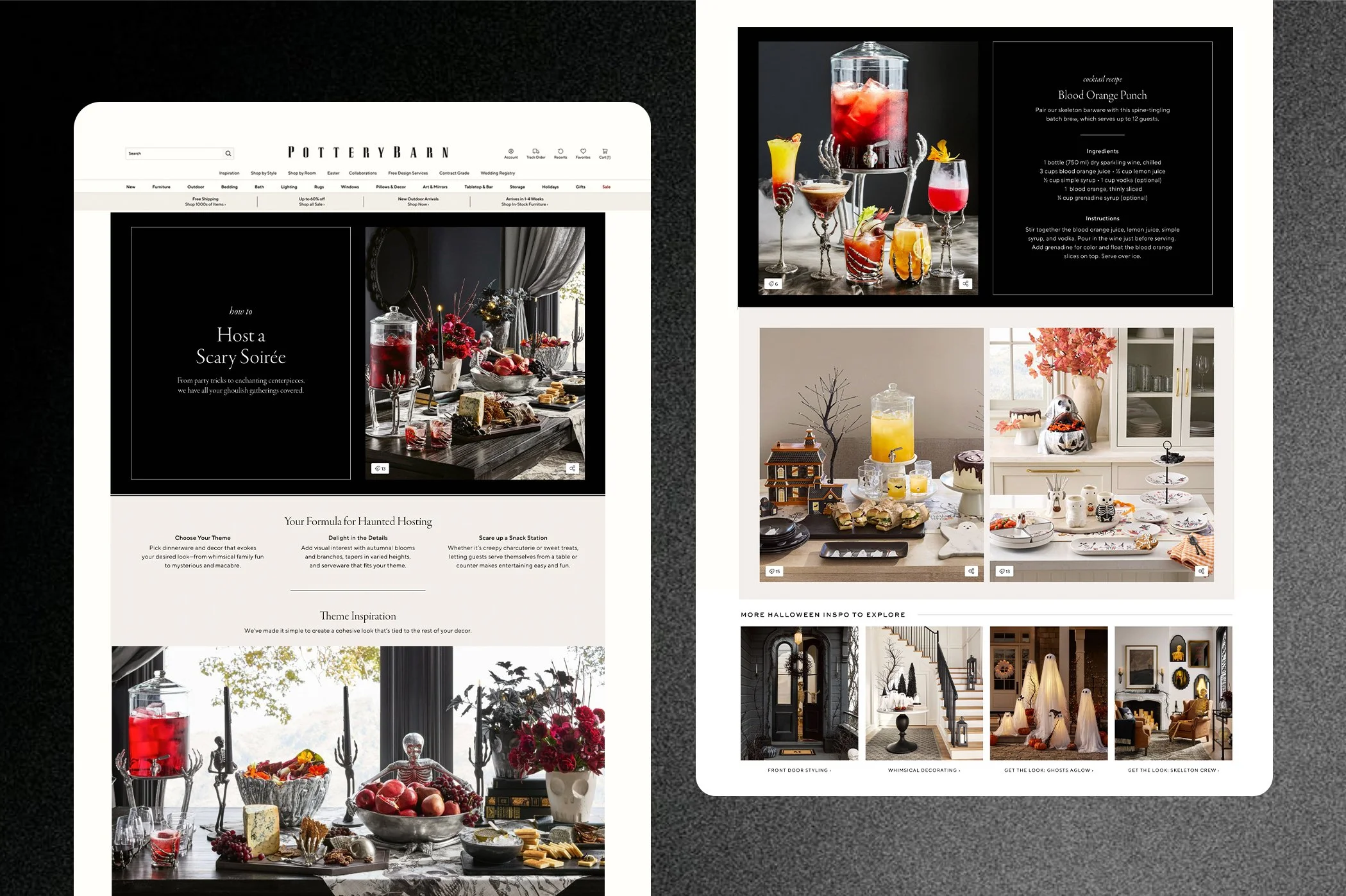
Midnight Manor was designed to feel sophisticated rather than spooky — black on black embossing and varnish creating depth and texture without leaning juvenile. The collection spanned tabletop and packaging, including a custom structural dieline I designed, die-cut in the shape of a haunted house, to hold a set of votive candles. I also designed the Halloween Headquarters landing page and the Host a Scary Soirée editorial.
Autumn at Pottery Barn was never just one thing — it was a full season, told collection by collection, from the first fallen leaf to the last candle burned down.
Midnight Manor was designed to feel sophisticated rather than spooky — black on black embossing and varnish creating depth and texture without leaning juvenile. The collection spanned tabletop and packaging, including a custom structural dieline I designed, die-cut in the shape of a haunted house, to hold a set of votive candles. I also designed the Halloween Headquarters landing page and the Host a Scary Soirée editorial.
Autumn at Pottery Barn was never just one thing — it was a full season, told collection by collection, from the first fallen leaf to the last candle burned down.