Spring and summer at Pottery Barn moved between worlds — from cottage-inspired Easter collections to hand-painted Mexican ceramics, relaxed Mediterranean neutrals, and classic Americana entertaining. Each story carried its own visual language while remaining part of a broader seasonal experience built across tabletop, packaging, home fragrance, and digital.
Across these collections, I developed brand identities, packaging systems, illustration libraries, structural dielines, naming, and digital creative — translating seasonal moods into cohesive worlds designed for both retail and e-commerce.
Sunlight through linen curtains. Long lunches outdoors. Citrus on the table, salt in the air, flowers beginning to bloom.
Sunlight through linen curtains. Long lunches outdoors. Citrus on the table, salt in the air, flowers beginning to bloom.
Spring and summer at Pottery Barn moved between worlds — from cottage-inspired Easter collections to hand-painted Mexican ceramics, relaxed Mediterranean neutrals, and classic Americana entertaining. Each story carried its own visual language while remaining part of a broader seasonal experience built across tabletop, packaging, home fragrance, and digital.
Across these collections, I developed brand identities, packaging systems, illustration libraries, structural dielines, naming, and digital creative — translating seasonal moods into cohesive worlds designed for both retail and e-commerce.
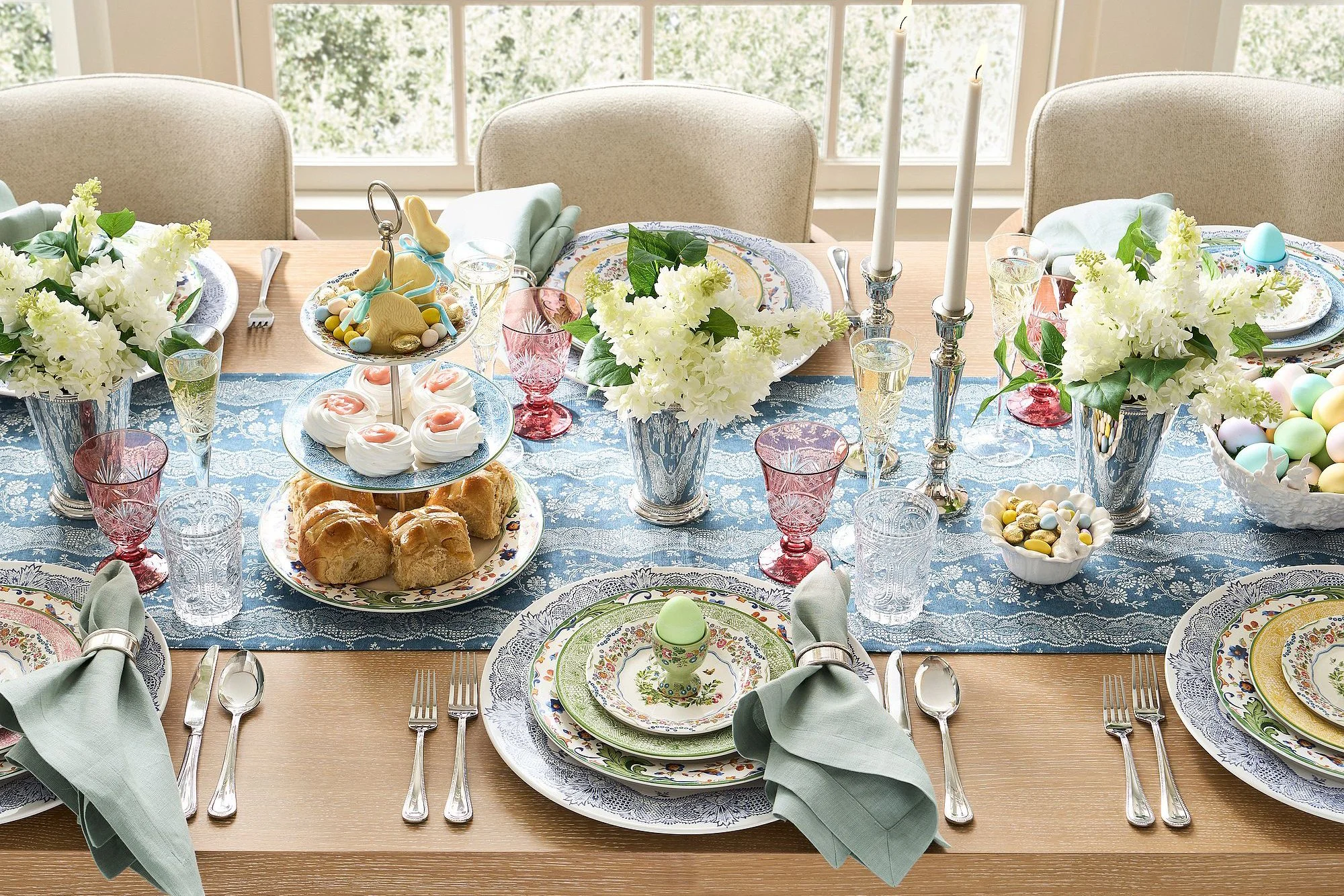
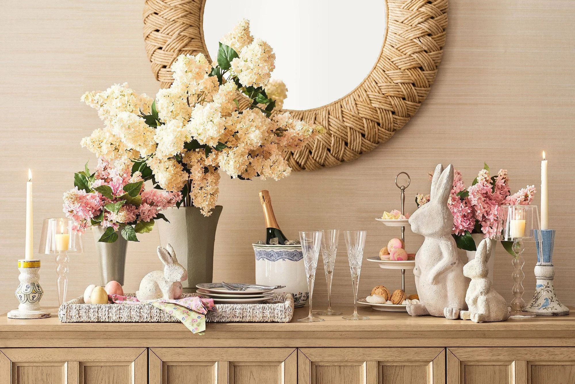
Botanical Bunny was designed to feel nostalgic and collected — soft florals, painted eggs, layered patterns, and the feeling of spring arriving indoors.
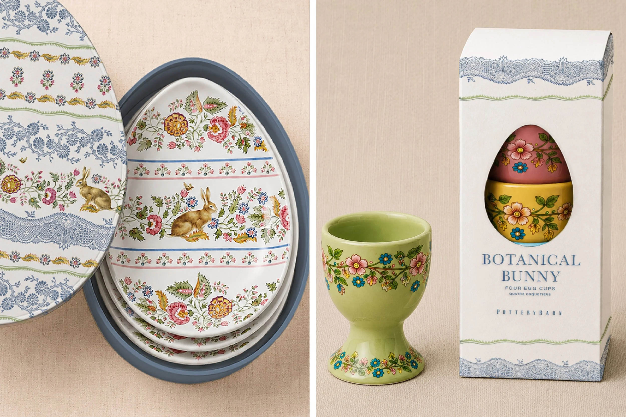
I designed a series of custom structural packaging dielines for the collection, including an egg-shaped plate box and an egg cup package featuring a die-cut window inspired by vintage confectionery packaging. The tabletop collection extended across multiple categories and coordinated patterns, all tied together through a delicate botanical illustration system.
Botanical Bunny was designed to feel nostalgic and collected — soft florals, painted eggs, layered patterns, and the feeling of spring arriving indoors.
I designed a series of custom structural packaging dielines for the collection, including an egg-shaped plate box and an egg cup package featuring a die-cut window inspired by vintage confectionery packaging. The tabletop collection extended across multiple categories and coordinated patterns, all tied together through a delicate botanical illustration system.
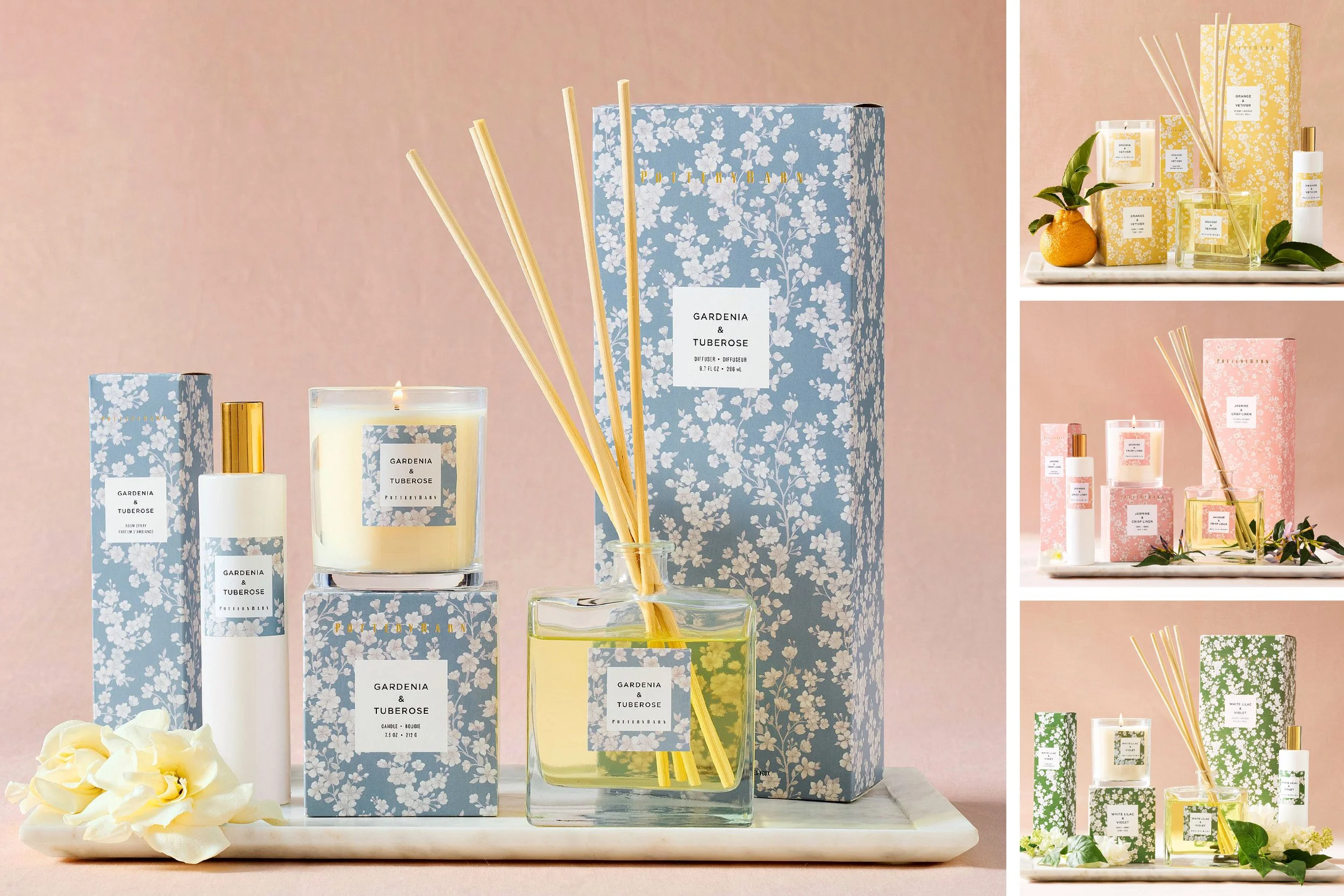
The accompanying Bloom home fragrance collection translated the same visual language into scent. Built across twelve SKUs and four fragrances, the packaging system included candles, room sprays, and diffusers wrapped in soft florals and pastel color palettes inspired by spring gardens and flowering branches.
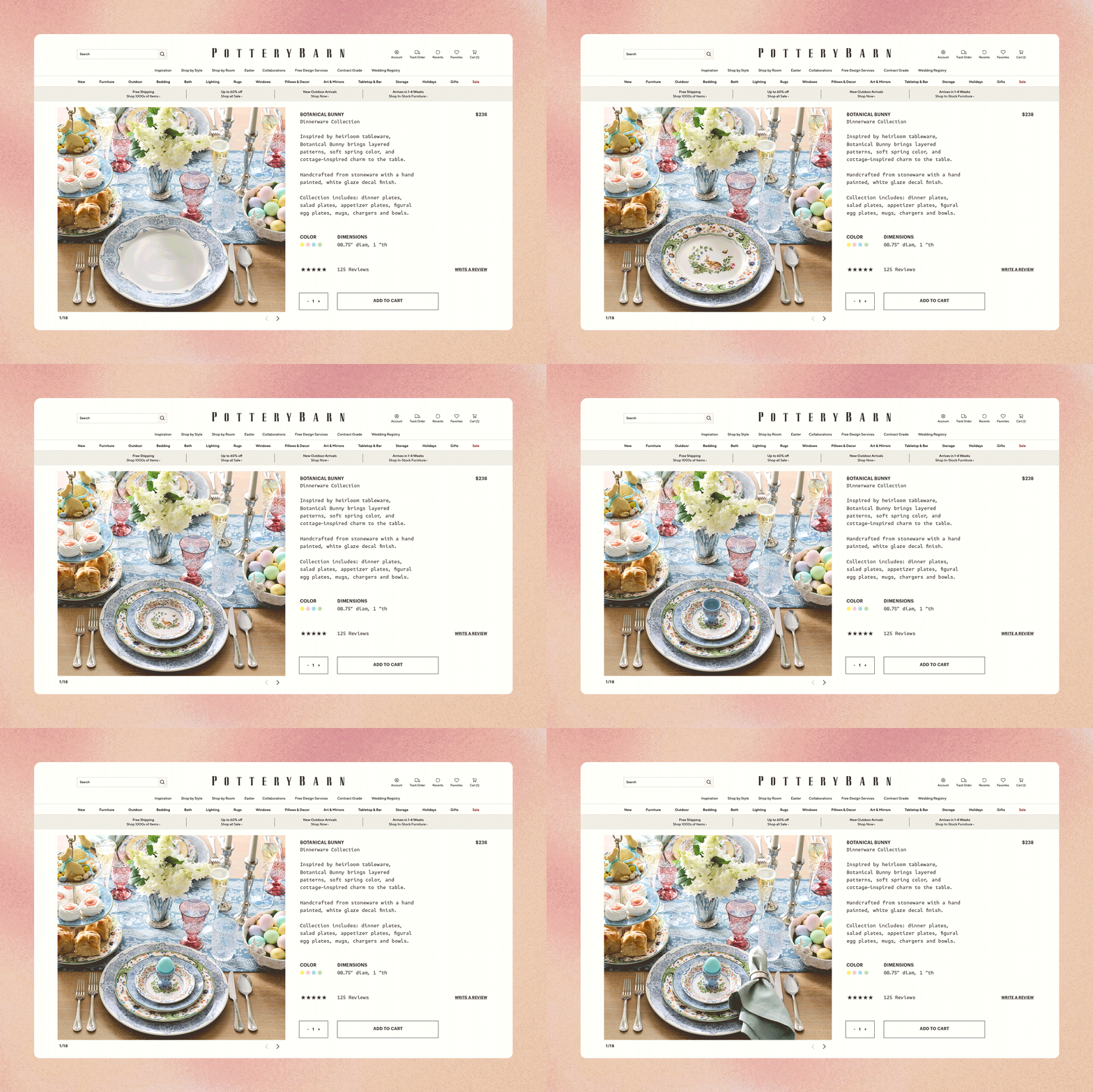
The collection also extended digitally through a seasonal landing page and e-commerce assets designed to bring the full tabletop story online.
The accompanying Bloom home fragrance collection translated the same visual language into scent. Built across twelve SKUs and four fragrances, the packaging system included candles, room sprays, and diffusers wrapped in soft florals and pastel color palettes inspired by spring gardens and flowering branches.
The collection also extended digitally through a seasonal landing page and e-commerce assets designed to bring the full tabletop story online.
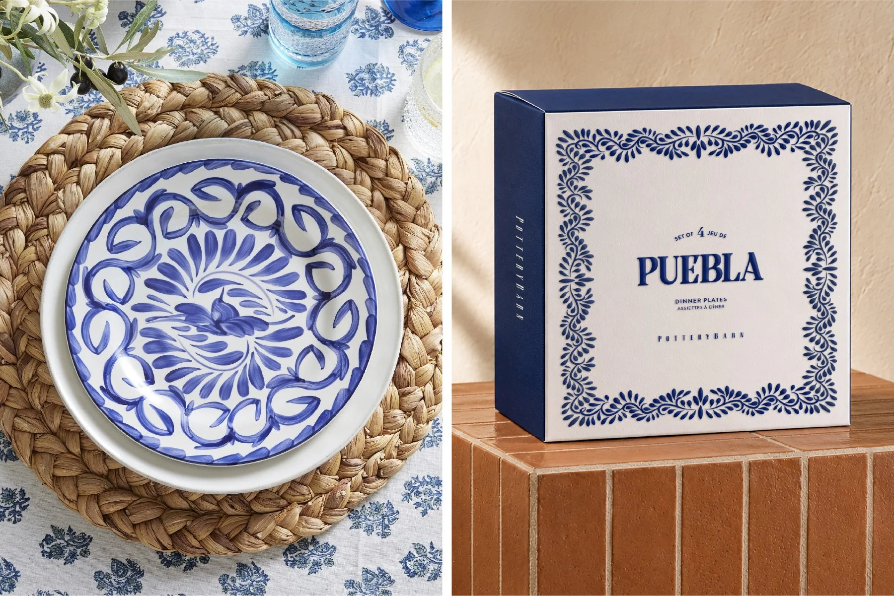
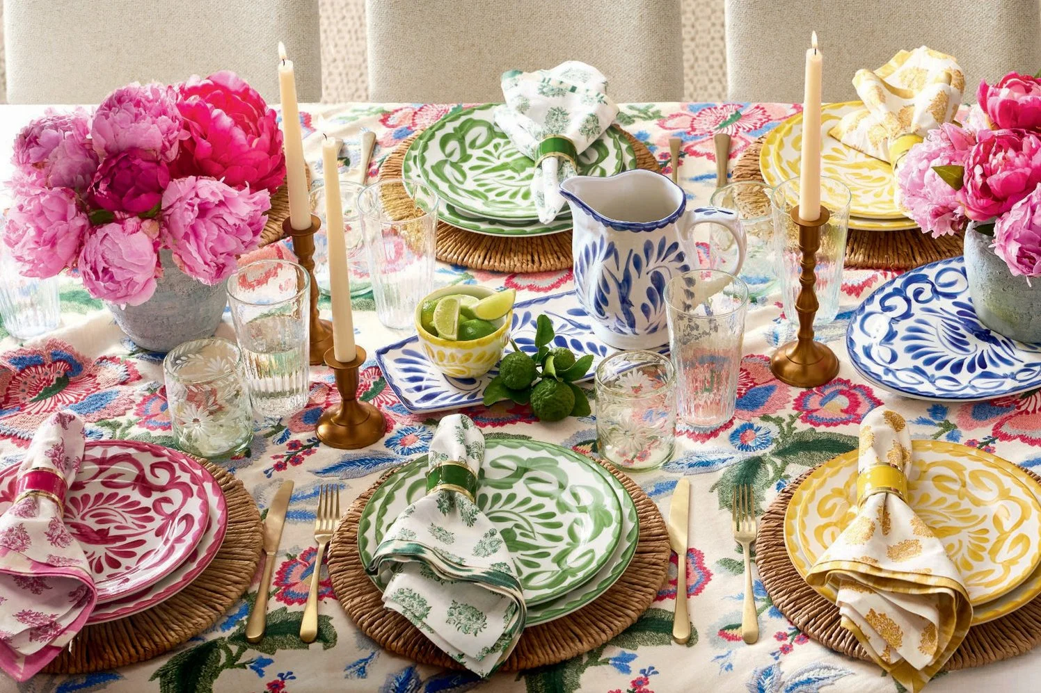
Summer entertaining became brighter, louder, and more handcrafted — layered tables, hand-painted ceramics, fresh citrus, and saturated color inspired by Mexican artisan pottery.
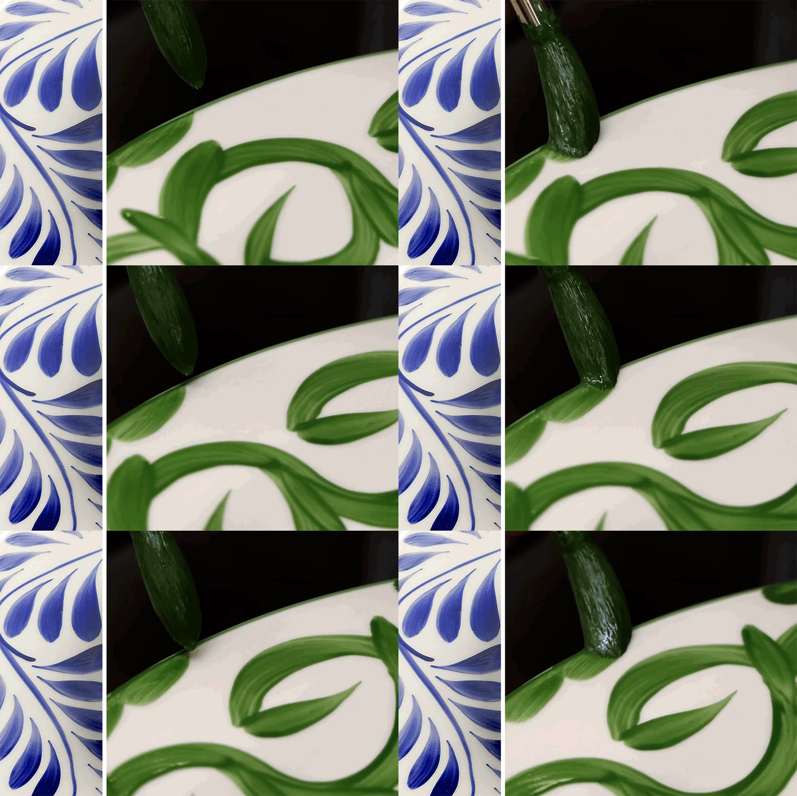
For Puebla, I developed the collection identity, hand-drawn pattern system, typography, and color palette across tabletop, serveware, glassware, and packaging. The identity extended across ceramic backstamps, gifting, and digital applications while remaining rooted in the handmade quality of the artwork itself.
Summer entertaining became brighter, louder, and more handcrafted — layered tables, hand-painted ceramics, fresh citrus, and saturated color inspired by Mexican artisan pottery.
For Puebla, I developed the collection identity, hand-drawn pattern system, typography, and color palette across tabletop, serveware, glassware, and packaging. The identity extended across ceramic backstamps, gifting, and digital applications while remaining rooted in the handmade quality of the artwork itself.
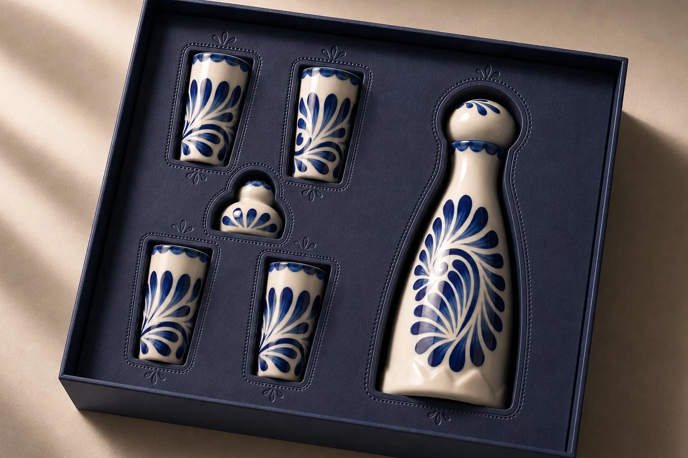
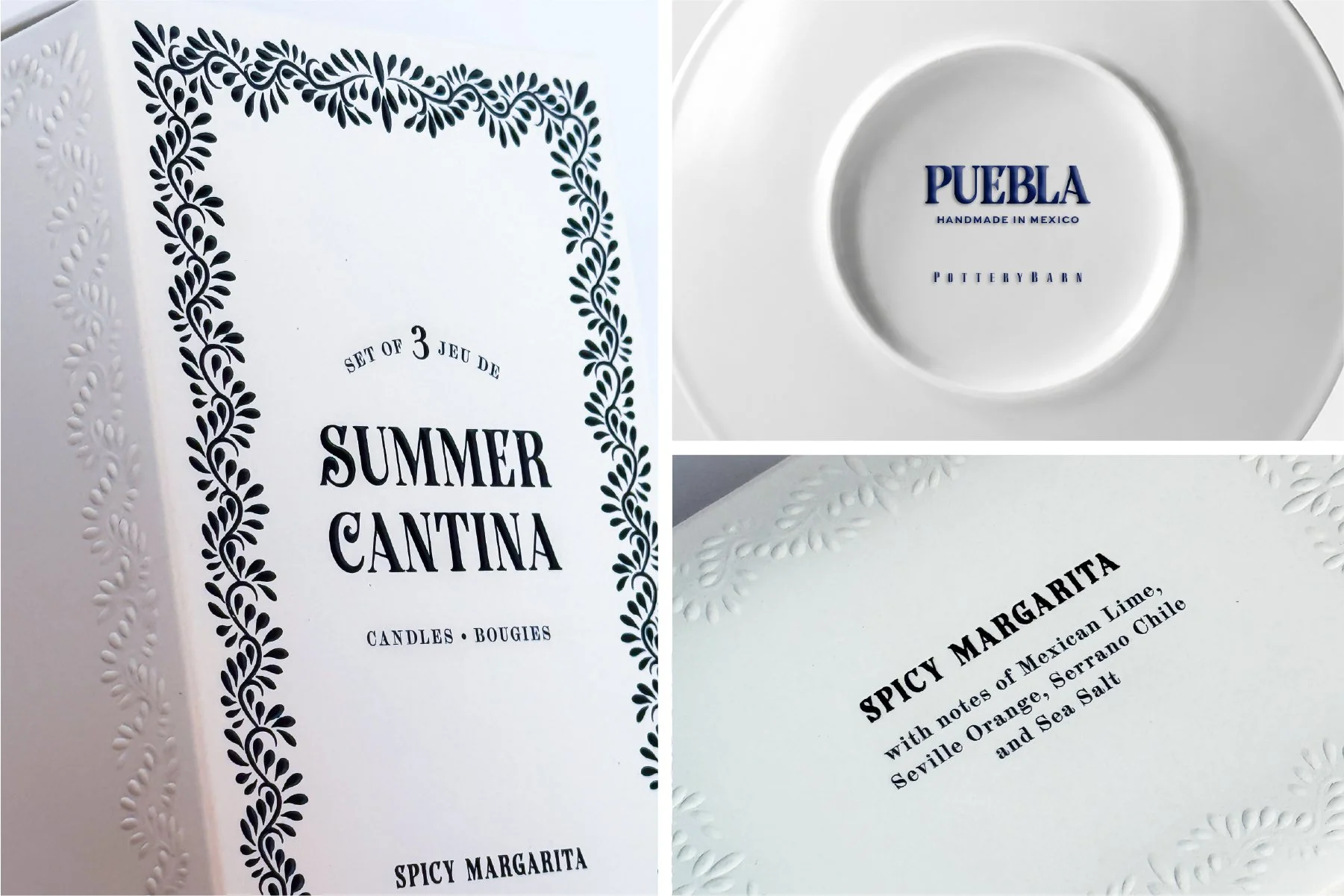
For the tequila gifting sets, I designed a packaging system inspired directly by the ceramic motifs, using embossed details, deep navy paper stocks, and tactile finishes to create a more elevated presentation.
Alongside the product design team, I helped bring the Summer Cantina fragrance collection to life — translating summer cocktails into scent while extending the hand-painted Puebla aesthetic into home fragrance. The candle packaging featured blind embossing on the side panels and we developed three fragrances: Spicy Margarita, Perfect Paloma, and Bloody Mary.
For the tequila gifting sets, I designed a packaging system inspired directly by the ceramic motifs, using embossed details, deep navy paper stocks, and tactile finishes to create a more elevated presentation.
Alongside the product design team, I helped bring the Summer Cantina fragrance collection to life — translating summer cocktails into scent while extending the hand-painted Puebla aesthetic into home fragrance. The candle packaging featured blind embossing on the side panels and we developed three fragrances: Spicy Margarita, Perfect Paloma, and Bloody Mary.
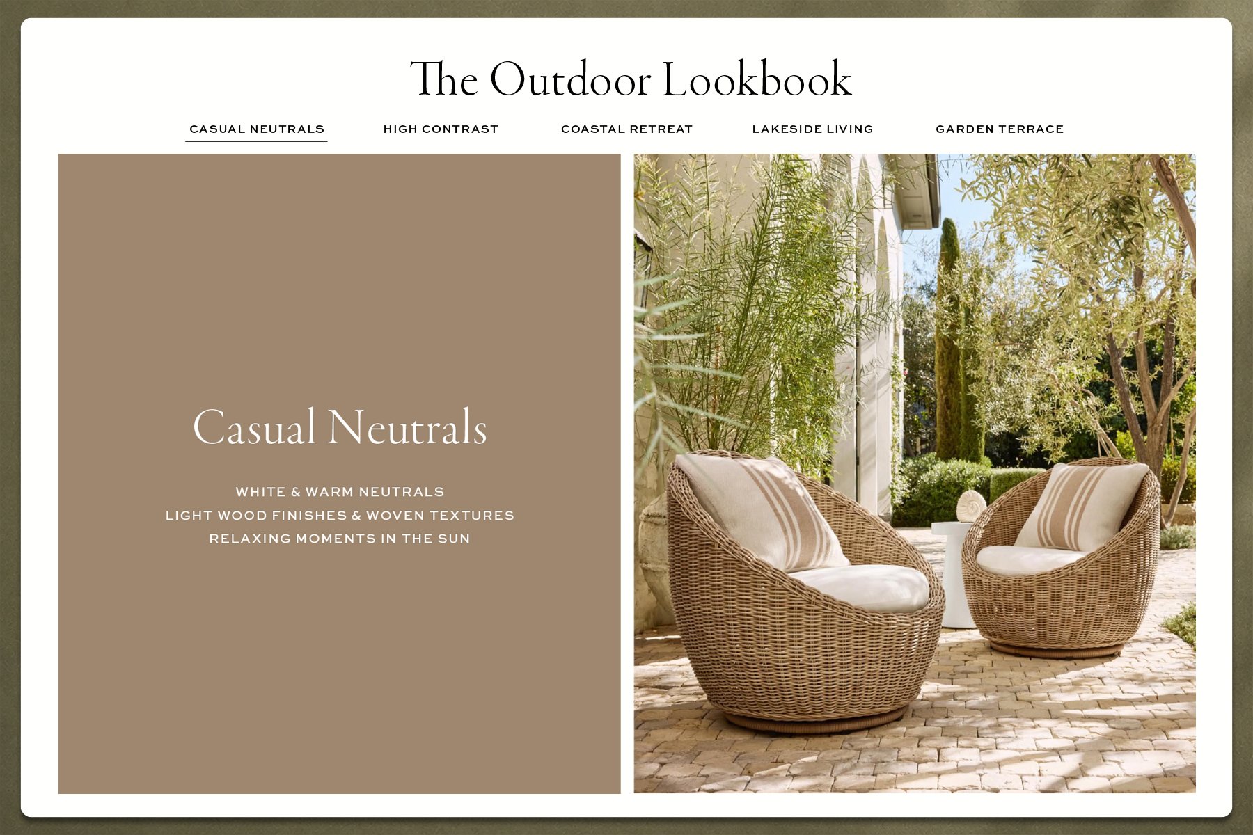
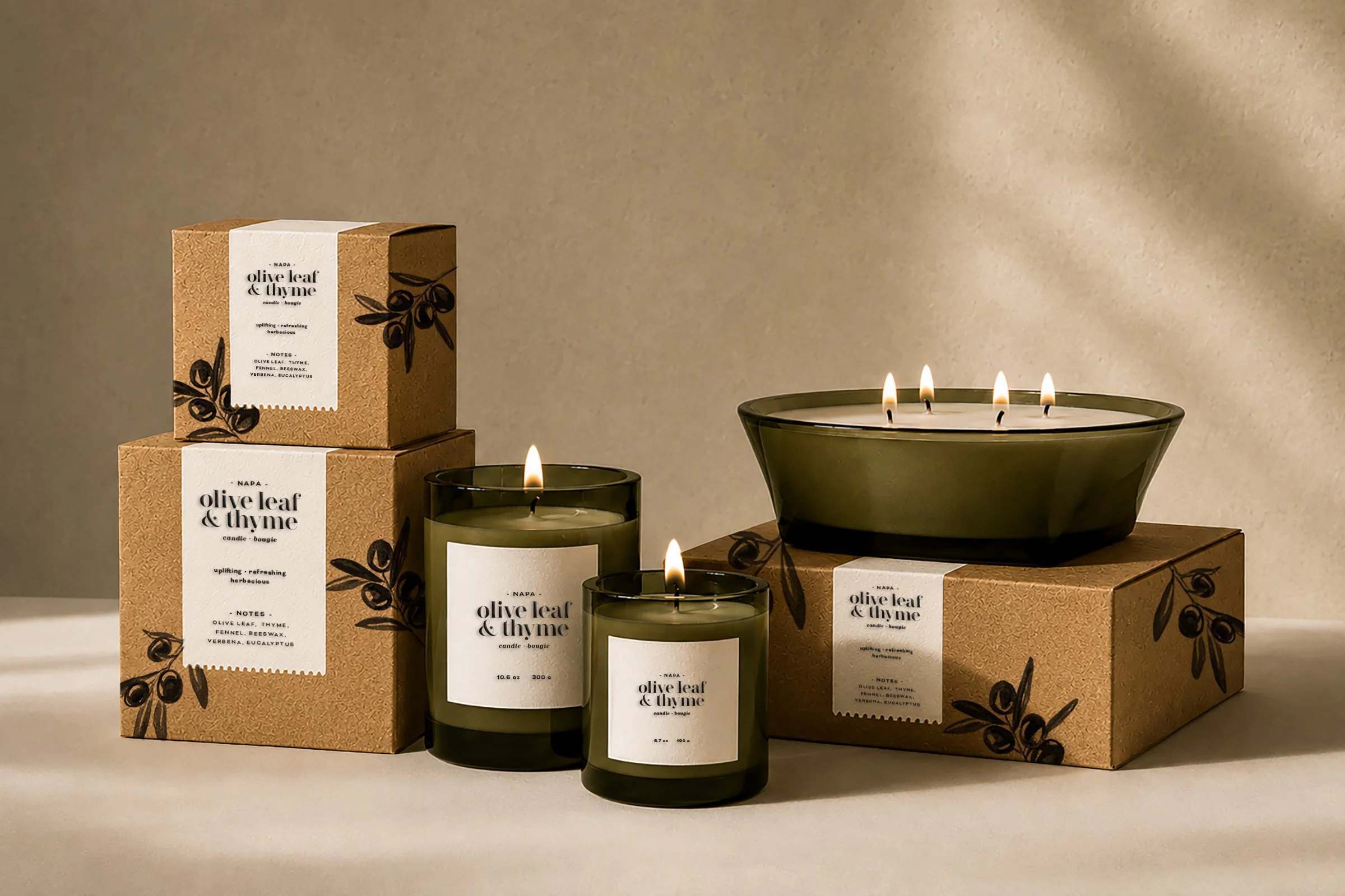
Not every summer story relied on color. Casual Neutrals focused on restraint — warm woods, woven textures, olive branches, sun-washed stone, and slower moments outdoors.
For the Olive Leaf & Thyme fragrance collection, I developed the visual identity, typography, illustration work, and packaging system. Kraft paper boxes, blind embossed stamp details, and inset labels with perforated stamp edges created a tactile, understated presentation inspired by Napa vineyards and California olive groves.
Not every summer story relied on color. Casual Neutrals focused on restraint — warm woods, woven textures, olive branches, sun-washed stone, and slower moments outdoors.
For the Olive Leaf & Thyme fragrance collection, I developed the visual identity, typography, illustration work, and packaging system. Kraft paper boxes, blind embossed stamp details, and inset labels with perforated stamp edges created a tactile, understated presentation inspired by Napa vineyards and California olive groves.
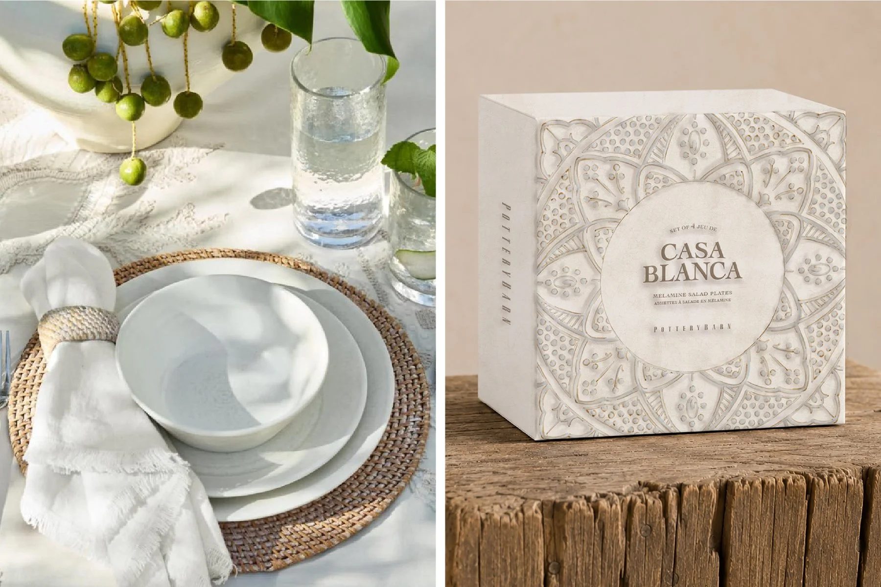
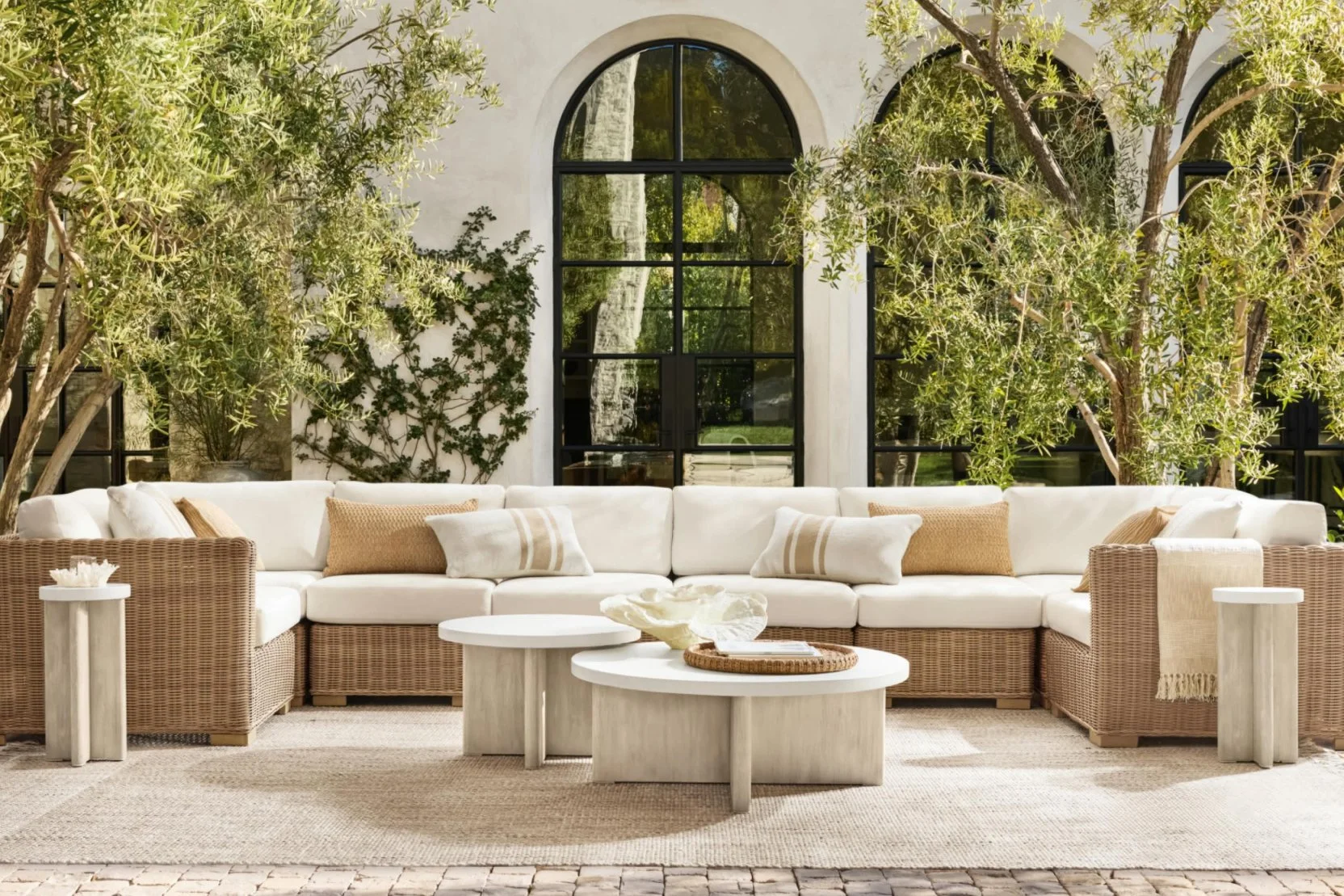
Casa Blanca explored a quieter side of summer through tonal neutrals, soft embossing, and layered texture — allowing material and form to become the primary visual language.
Casa Blanca explored a quieter side of summer through tonal neutrals, soft embossing, and layered texture — allowing material and form to become the primary visual language.
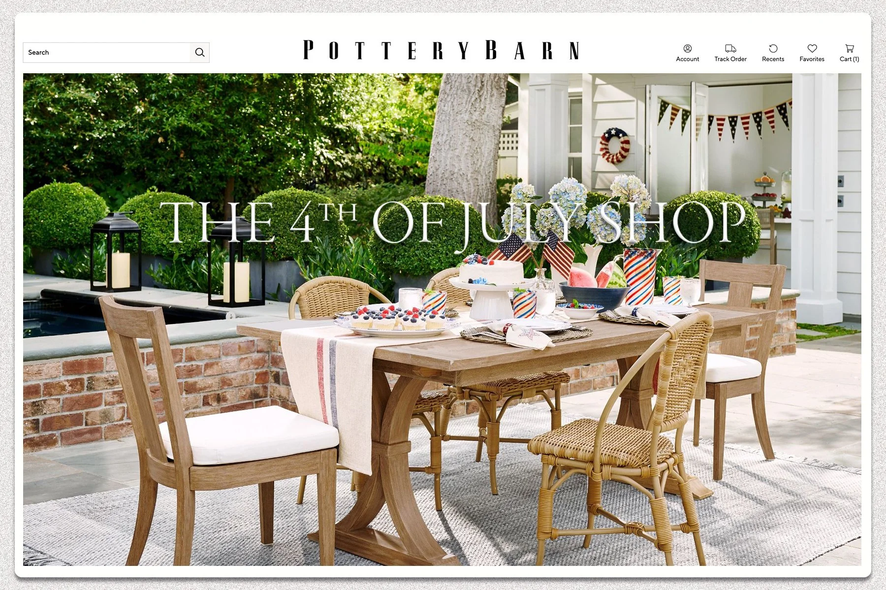
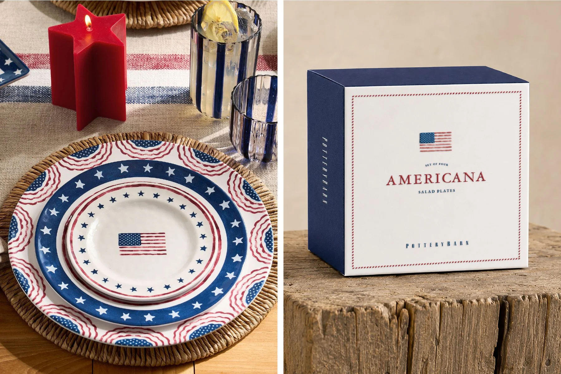
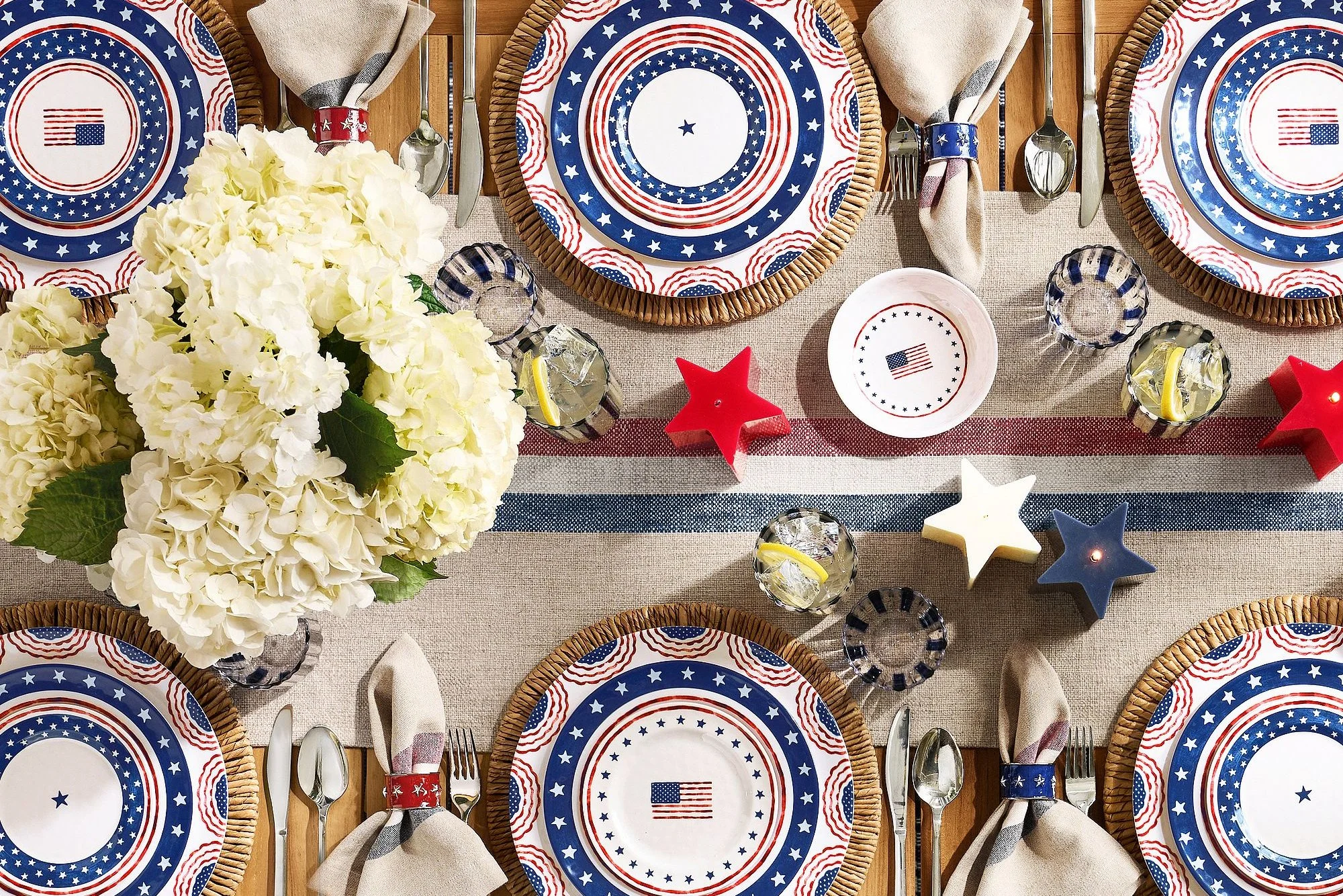
Summer ended with Americana entertaining — striped linens, hydrangeas on the table, candles burning after sunset, and classic red, white, and blue reimagined through a softer, more elevated lens.
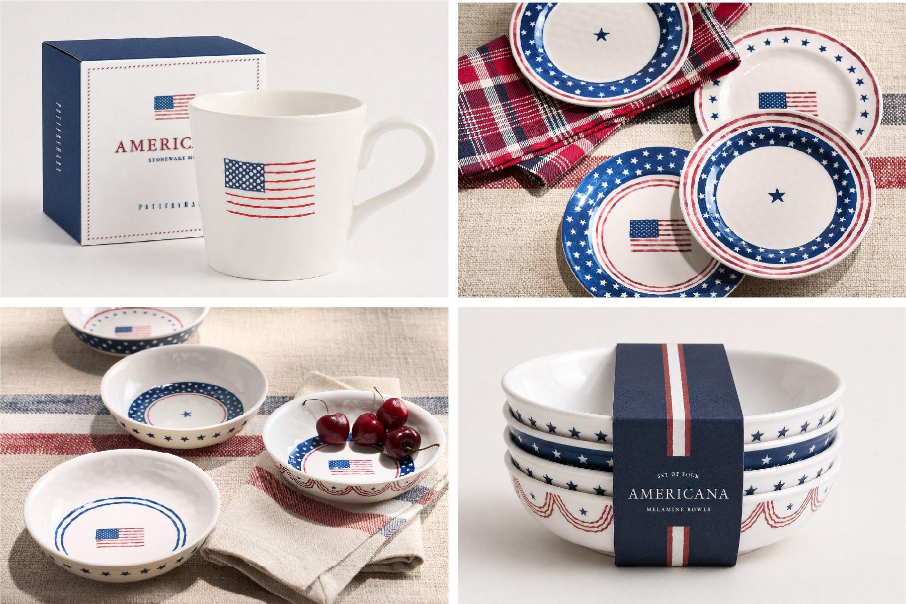
For the Americana collection, I designed tabletop packaging and graphic systems inspired by vintage flags, bunting, ticking stripes, and traditional summer entertaining. The collection extended across dinnerware, mugs, serving pieces, and gifting designed to feel timeless rather than novelty-driven.
Summer ended with Americana entertaining — striped linens, hydrangeas on the table, candles burning after sunset, and classic red, white, and blue reimagined through a softer, more elevated lens.
For the Americana collection, I designed tabletop packaging and graphic systems inspired by vintage flags, bunting, ticking stripes, and traditional summer entertaining. The collection extended across dinnerware, mugs, serving pieces, and gifting designed to feel timeless rather than novelty-driven.
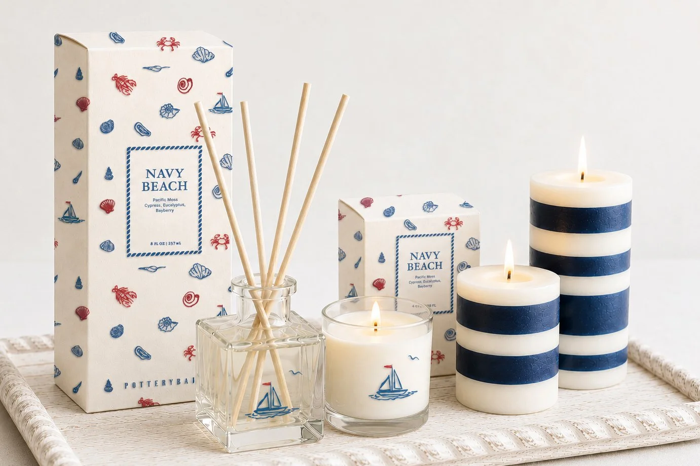
The Navy Beach fragrance collection translated coastal Americana into home scent packaging through nautical stripes, sailboat illustrations, and crisp blue-and-white palettes inspired by summers by the water.
The Navy Beach fragrance collection translated coastal Americana into home scent packaging through nautical stripes, sailboat illustrations, and crisp blue-and-white palettes inspired by summers by the water.